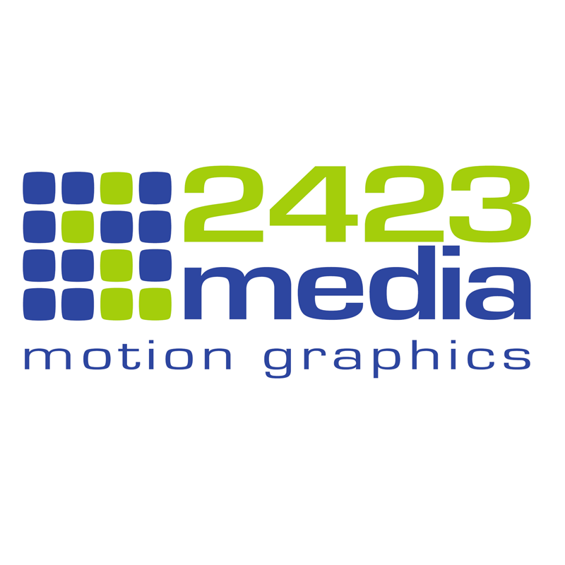
2423 Media Logo
2423media | Tue, 11/08/2011 - 19:17
Brief from client
As a young motion graphics company, we wanted an updated logo that was simple and contained a graphical element other than text for branding. The "blocks" of the new logo represent both the pixels that make up a video image and as binary (digital) numbers can be read as the numbers 2-4-2-3.
8 Comments
I like the idea behind the symbol.. I would never have figured it out, but I'm not in the motion graphics business. But... you are getting a lot of weird negative space in the typo. The numbers rise above the symbol, pushing out of frame. I would solve this by using caps for media. The more I look at it, the font for "media" isn't my favorite either. It will look pretty solid with all caps though.
Idea: I like the explanation of design concept behind the logo, but the majority of the people who will enlist your services will have no idea what they're looking at. Remember, design is supposed to communicate on a certain level, give people an impression of what you do, without having to say a word. Symbol: feels generic, it's just a square grid. Typography: This font reminds me of Eurostile, which was a very popular font back in the 90's, so it feels dated. Colors: speaking of dated, the colors are more reminiscent of the early 90's/late 80's. Sorry to be so harsh, just being honest though.
Idea & Symbol: I like the concept and I think you've created an abstract version of that inspiration. Contrary to the previous critique, a logo IS your brand. It is whatever you want it to be to identify yourself from other companies. It is not necessarily a visual or literal representation of what you do.
Typo & Colors: Again, contrary to the previous critique, I liked the 80's and 90's and I think this type is bold and clean. Same with the colors.
Sure, your logo is your brand. It can be whatever you want it to be. Agree. Just talking about the nature of design vs art, communication vs leaving something open to interpretation.
Your explanation for symbol is fine but do you really think your clients will be able to get it without your lengthy explanation about what it really means?
Motion graphics logo does not have to rely on some standard overused concept, which you obviously tried to avoid here, there are still a lot of unexplored territory here and some concepts that could convey your message to the clients more clearly.
Typography is pretty dull and composed like this, your logo reminds me of some phone service call center company.
Cold, almost neon colors probably work fine in motion graphic with shadings and light but for print.... not quite.
Thanks for the comments. To answer your question, the logo explanation is provided as the inspiration of the development. If someone asks, we'll tell them, but it's not key to doing business. Also thanks for the "phone service" reference...being dull and rigid was a design goal because those logos animate really well. Plus, the old Bell System typography is one of our favs.
I like the idea and the symbol but there is a famous company who used this very same idea.
Eighty-20 is a small consulting firm. The squares actually a binary code for the name. Top line: 1010000 and on the bottom: 0010100.
Thanks for the comments. Although a continent away, the similarities with 80/20 are too similar. We'll work on the alternate.