Aleika
Alexun | Sat, 01/31/2015 - 21:28
Brief from client
Identity for a fashion jewelry online store, they are looking for strong empowered women ages 25-45, they want the identity to feel strong but feminine.
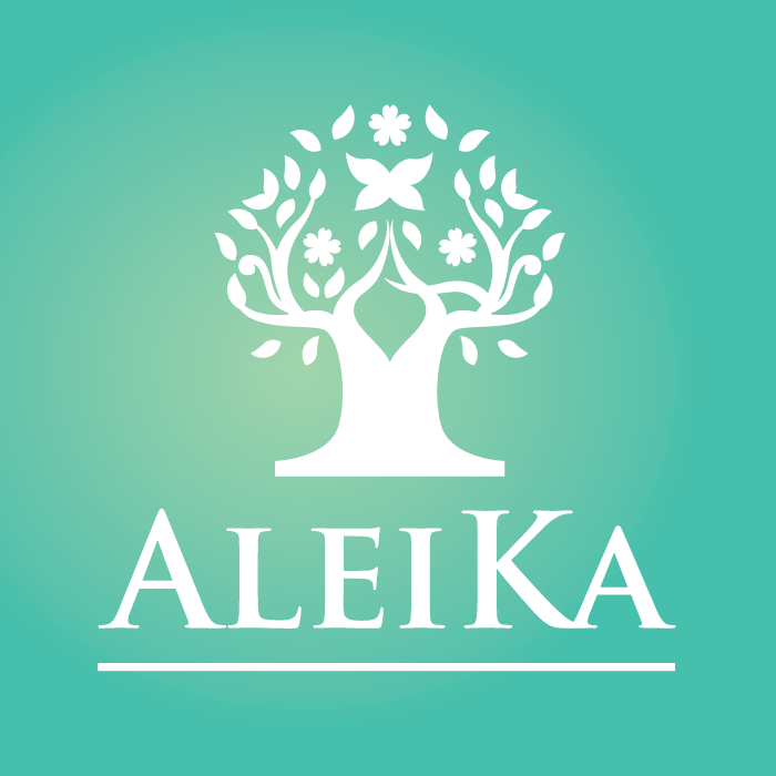
After some options presented to the client we decided to go for a Cherry blossom tree as icon trying to go for something very strong and grounded but with the capacity to be free (floating flowers and leaves) and a feminine look (on blossom,) by the clients request we include a butterfly in the middle.
I think there is to many elements on the icon but i really like the feel of it,I would really appreciate a second opinion on this one. thank you
2 Comments
The mirrored look hurts the logo, in my opinion, despite one or two subtle differences to attempt to hide it.
Also, you have illogical height differences. The K shouldn't be taller than the outer letters. Make the last A as large as the first one, and reduce the size of the K to match the inner letters.
I think the mirroring thing wouldn't be a problem if the trunk of the tree wasn't so large.
And I agree with Killswitch on the font work, the caps K serves no useful purpose, it's gimmicky and throws the whole think off balance.
Globally, this is a good start. Keep it up!