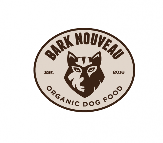
Bark Nouveau
M@ | Fri, 07/22/2016 - 13:54
Brief from client
To create a logo for a company selling organic dog food.
they would like the the logo to be in the style of old beer mats and vintage looking.
Include an image of a wolf or dog that doesn't look too angry

So I'm starting to go a bit nuts with this logo now! I'm really struggling to do a wolf/dog face that fits to the style that I'm trying to achieve, probably because i haven't drawn anything like an animal in such a long time!
Anyway here's a completely different version which I'm liking too. I think it still has that old skool vibe to it. I done the wolf face completely from scratch this time and i hope it doesnt appear to clip-arty but i will let you fine people be the judge of that! :)


11 Comments
Matt, Matt, Matt, Matt, Matt, Matt, no. The last three or more versions were so much better, they had so much more potential for branding variations and packaging design. This is just a mishmash of uncomplimentary fonts, poor balance and bland colors.
I know I'm being harsh, hopefully that is evened out by how much I like the earlier versions, I'd hate to be taken off of your Xmas card list.
Hahaha! i had a good laugh reading this! I get what you mean but I think the fonts work quite well with each other with exception of the est. 2016.
I've done tons of different versions now all just slightly different from each other and I'm starting to lose my mind! Ive been staring at this wolf face that im trying to do and now i think it looks more like a tiger!
Sorry, I 100% agree with Fred here. This is not at all an improvement. The text looks like an afterthought, with no evident planning or purpose. The previous versions were so much more authentic looking, with a clear sense of design.
I think it's worth the effort to really work on a badass looking wolf. It will do the logo and your portfolio justice. Seriously. Put your illustration/drawing skills to the test!
To save uploading lots of different versions, below is an image of the 6 different ones i have done. Which one do you prefer? (click on the image to see it larger)
1b, hands down.
Ditto (and 2a as well)
thanks guys :)
I really favor your first few versions so much more over this one =(
The new doggy is not doing all the other elements any justice. I say, keep the "bones" you have from the opt 1b and opt 2a and do lots of research on dogs til you find something that compliments them.
I agree with pretty much all of the above- he looks a little high school team mascot.
Mmh na, this one isn't working for. It's even a serious downgrade from the first versions.
The shape looks it doesn't know if it wants to be an oval or a circle.
I thing it's a good thing to come up with your own design for the wolf head, but the problem, and I just realize that now, is that it's dog food. Shouldn't look more like an actual dog?
Option 1b is the best for me. The art direction is great and this one here isn't up to par.
I'd keep working on that symbol to make it more.... doggy style *puts on his sun glasses*
of this new selection of 6, 2A is the best for me. I don't like the top versions because they look like an oil drum.
And the very top image is a huge step backwards. It's generic and looks like an app design. I know the trend towards flat design is everywhere, but for product packaging, the earlier versions have so much more character. Don't lose that. Look at Burt's Bees- not the most polished drawing but their branding is outstanding. The logo fits the product.
the wolf you drew has a lot of character-its a unique mark. don't follow the trend without good reason.
1b looks pretty sharp although you traced the wolf's head