Canal Cycle
Brief from client
A bicycle hire company in Amsterdam would like a custom logo design. Canal Cycle is situated in a popular tourist area within the city & would like to appeal to visitors with a strong & modern, typographic logo. They would love a logo using custom type, so be creative & bold!
Target Audience: City Cyclers
This is a brief from a website called briefbox which has a lot of practice briefs. I am new to logo design so I thought it would be good practice to start there.
Going on the reference and the brief provided I created script lettering with thick lines and not too much contrast between them, which to me stands out and shows boldness. Also I tried to achieve that modern feel with the script.
I am new to logos and eager to learn so please don't hold back.
Thank you
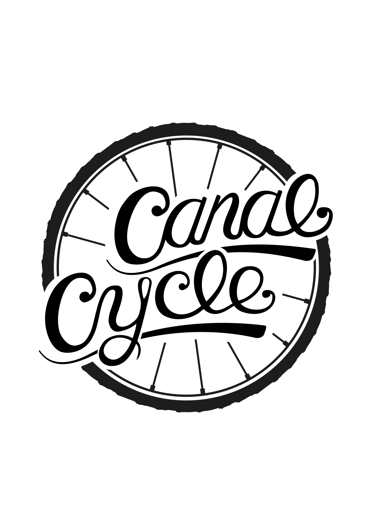
Going on the critiques I added a bit more variation to it, randomized the spoke lengths and made the wheel look more like a bicycle wheel.
Cleaned up a few things and changed up the 'E' to fit in with the design more.
I slightly lightened up the wheel to try and replicate a sort of rubber black and also to draw a bit more attention to the wording.
1 Comments
The ligature between L and E in cycle still needs work- it does not flow smoothly like your other letters. It looks "bent" to meet the E.