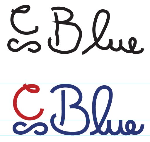
Cblue Cursive Edition
Brief from client
I am making a special edition card that is supposed to have our logo in a cursive style.
I did not want to use a font and also couldn't find one that I liked with a even line.

We are making a special edition card and a cursive version of our logo was wanted, and because I am a designer I wanted to do it myself, with out font, but I have horrible penmanship. I drew inspiration from Shawali's post and he said he drew his type by fonts then adjusted the Bézier curves.
Needless to say when I first drew it by hand with the mouse I was already discouraged, I posted what I started out with so I could show you how far I had to come.
Anyway, I just want you to tell me if this looks good, I am not surrounded by creatives but I always want my stuff to be up to the highest quality.
So give me some feed back please.


2 Comments
Sorry for the late comment on this one.
Ok, I see what you tried to do here, but unfortunately, the end result isn't really working. Digital lettering (rather than hand lettering) is more than just writing something and then tweaking the curves away. The sketching part is the most important and probably what takes the longest time.
For my Speedle Mood and Putz logos, I must have drawn hundreds of sketches, trying to figure out what works and what doesn't, how I can create cool ligatures, etc. And when I have a pretty clear idea of the direction I want to take, this is when the hard part starts: I draw that effing logo over and over again, until muscle memory kicks in and I wind up with something I can work with.
Hand lettering is still a new thing for me (I started working on it a year ago), so the digital part of the process is still preponderant to how the final logo will look like. That's why I call it digital lettering for now. But my goal is to to be able to come up with a hand-lettered logo that doesn't look different on paper and on screen, and to keep the digital part only for fine tuning.
It's a long process and only work and experience will get you where you want to go. Also, inspiration. If you haven't already, get yourself a Pinterest account and follow every typography and lettering boards you can find. You can start with mine : https://www.pinterest.com/shawali/typography-hand-lettering-heaven/
It's very useful to get your daily fix of beautifully hand-made letters and ligatures =)
Keep it up!
I think it's safe to say that his first mistake is doing it using a mouse. Tablets are the only way to go for this kind of work. Am I right?