Dedoles
murcatko | Mon, 04/13/2015 - 18:38
Brief from client
We're a company selling T-shirts and other ECO products. Our target group are women above 30. The emotion we want to communicate are FRIENDLY, NATURAL and INSPIRING. The logo is a representation of our values and of the company name DedoLes (from Slovak; dedo - grandpa, les - woods).
However, we are unsure if it isn't too modern for our target group. This is the current logo of Dedoles - http://dedoles.sk/image/data/dedoles_logo.png
11 Comments
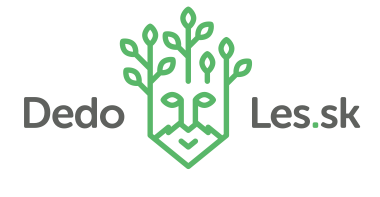
I think this logo works a lot better than the current one. Although, I think the symbol separates the type which creates a pause as I'm reading it. I would play with the orientation of the logo, and maybe stack the type and put the symbol above it as a smaller size. This symbol can also work on it's own, which is a strong feature of the logo. Hope this helps
I am Groot! (sorry, that's what I thought of immediately)
In all seriousness, these are my thoughts: don't separate your text like that. Dedo and Les.sk look like separate entities, however I see in your link it goes to DedoLes.sk. I would resolve this so you have a clear company name, and maybe put the .sk in another color to indicate where the name ends and the website extension begins.
Secondly, I wonder if your logo could be changed to leaves coming out of a shirt instead of a head. It's a good idea, but if your target products are shirts and other eco-friendly products, it might be a good idea to represent those.
Great work.
I agree with what is said above, do not separate the text.
I do not get why you used a head.
I like the work in general, much better than the recent one
The head was used because part of the name is "dedo" (meaning grandpa in Slovak). Thus, he looks kind of like an old man.
Perfect!
Great symbol, good fonts but terrible composition.
If the name is "Dedoles" in one word, don't hyphenate it. And please get rid of the .sk, it shouldn't be in the logo! It just creates more confusion.
Keep thing simple. The word mark in one word, the symbol right above it and you'll have a neat logo.
Good job!
The only thing I would change would be to use curved lines around the mouth like the lines elderly people have coming down. To make that look like a heart around the mouth instead of the lightening bolt type lines you have now. Other than that, its nice!
Good job, it's awesome! And yes, the text would look better put together under the symbol.
Good job! But put the text closer to the symbol.
When your team accepts a new client https://stumble-guys.co, you must then make it a regular practice to use a client brief.