Brands of the World is the largest free library of downloadable vector logos, and a logo critique community. Search and download vector logos in AI, EPS, PDF, SVG, and CDR formats. If you have a logo that is not yet present in the library, we urge you to upload it. Thank you for your participation.
Look brother- you ain't foolin' nobody! These logos would NEVER pass for sports logos- spend even 12 seconds doing some research and you will see why! You can't just stare at letters until you find 2 or 3 that fit together AND THEN assign a made up name or company to them!!! That's. Not. How. This. Works.
Blog, hypothetical, or otherwise!
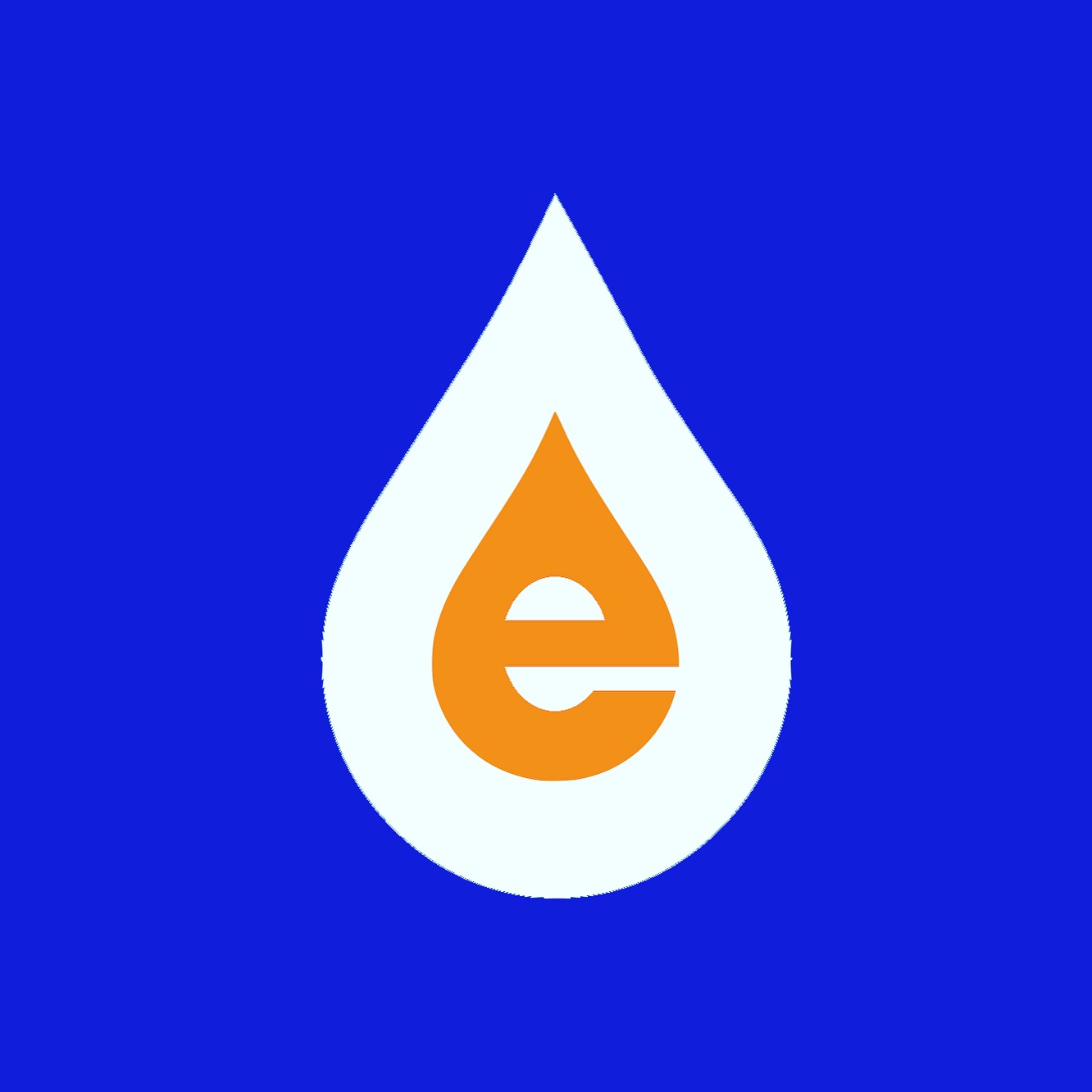
Sadly, for this one if you had made up that it was for an energy, hydro-electric, or water related company- you might have gotten some majorly positive feedback. Because, aside from the details you miss like refining the curves, and keeping the stroke weight of the "e" uniform, this could be a cool logo mark.
But not for a sports team! And I'm pretty sure that has been mentioned several times already.
I really thought that this was for an energy company.
I'm sorry, but trying to make sports logos monograms is never going to happen. There is a way to streamline sports logos without completely stripping their entire brand recognition.
Thank you all for your feedbacks! I will take everything into consideration , as that is the way to learn and get better. However, there are sport teams that do have monograms as their logos : " Yankees ", " Giants ", " 49 niners " , " Canadiens ", " Dodgers " , " Rockies " - just to name a few...
The yankees also uses this logo, constantly. The monogram version only exists because of a marketing campaign with Tiffany and Co. after the death of a fallen officer.
There is a team like San Diego, Minnesota, NY Mets - are all gone with monograms. Plus a large number of famous soccer teams worldwide that using monograms since day one.
12 Comments
Look brother- you ain't foolin' nobody! These logos would NEVER pass for sports logos- spend even 12 seconds doing some research and you will see why! You can't just stare at letters until you find 2 or 3 that fit together AND THEN assign a made up name or company to them!!! That's. Not. How. This. Works.
Blog, hypothetical, or otherwise!
Sadly, for this one if you had made up that it was for an energy, hydro-electric, or water related company- you might have gotten some majorly positive feedback. Because, aside from the details you miss like refining the curves, and keeping the stroke weight of the "e" uniform, this could be a cool logo mark.
But not for a sports team! And I'm pretty sure that has been mentioned several times already.
I really thought that this was for an energy company.
I'm sorry, but trying to make sports logos monograms is never going to happen. There is a way to streamline sports logos without completely stripping their entire brand recognition.
Thank you all for your feedbacks! I will take everything into consideration , as that is the way to learn and get better. However, there are sport teams that do have monograms as their logos : " Yankees ", " Giants ", " 49 niners " , " Canadiens ", " Dodgers " , " Rockies " - just to name a few...
The Giants logo isn't a monogram. They have a wordmark, not a monogram.
I was referring to San Francisco Giants.
" NY " in a blue circle below is what NY Giants are using on their helmets.
They also use a wordmark though.
All of which is incredibly stylized and ingrained in their branding.
What you're doing is completely stripping ingrained branding from these teams, and giving them very generic monograms.
They also use an actual baseball logo.
The yankees also uses this logo, constantly. The monogram version only exists because of a marketing campaign with Tiffany and Co. after the death of a fallen officer.
Dodgers also has a hand done word mark.
Baseball teams tend to be more simplistic, but still use very custom word marks.
As far as the Rockies go,
This monogram is simply terrible and uninspired.
There is a team like San Diego, Minnesota, NY Mets - are all gone with monograms. Plus a large number of famous soccer teams worldwide that using monograms since day one.