EDTECH
EDCARLOS FERREI... | Mon, 01/19/2015 - 00:15
Brief from client
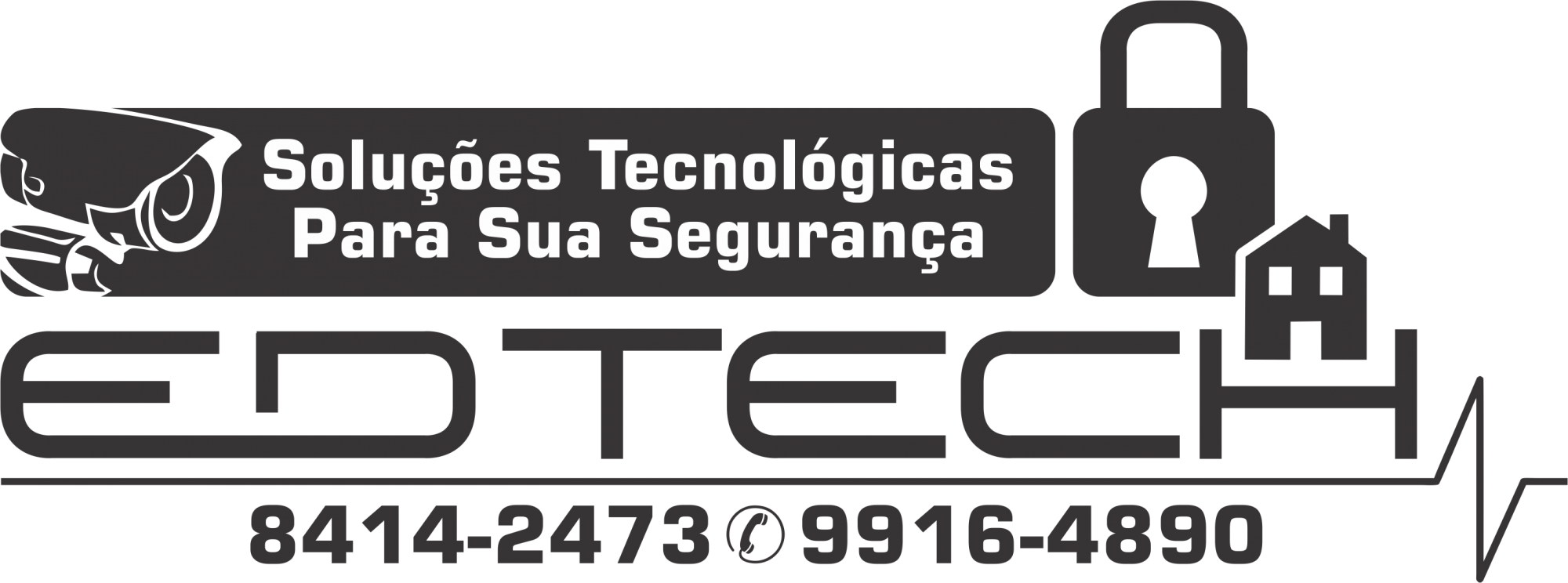
Empresa prestadora de serviços de segurança eletrônica e informática.
Logo baseada na simplicidade de leitura.
Empresa prestadora de serviços de segurança eletrônica e informática.
Logo baseada na simplicidade de leitura.
6 Comments
English please. And there's nothing simple to read in this mess of a logo. (yes, I can read a bit of Portuguese but still, use English)
Why is there a heartbeat monitor line at the bottom? Why are there so many stock images on this? Why so many font choices? (Are there 3? or 2? hard to tell with the numbers if they go with the 'Solucoes' line.)
Yeah, I'm not even sure what that object is in the upper left. It could be anything from a muffler to a Portal gun. My guess is a security camera?
Given there is a house and a key in this logo, I'd think you'd win that bet.
Regardless, this isn't a logo. This is a novel!
It's a mix of symbols, not simple to read. Please don't put telephone number in the logo, this is mark of amateurism.
(Está uma mistura de símbolos e não é simples de ler. Por favor não coloque número de telefone na logo, isso e sinal de amadorismo.)
a logo shouldn't be crowded like that and have so many symbols in it.
And it feels blah all in black, nothing stands out.