Brief from client
This client have a construction business, specialized in building hangars and sheds.

This logo is in Portuguese.
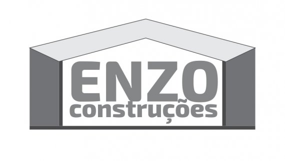
Is just a simple logo, i'm even using strokes. The roof give that kind of perspective if you guys can notice.
Translation: "Enzo Constructions"
Suggestions are welcome.
4 Comments
It's not doing anything for me. The type is way too close to the edges, and there's no spacing between the subtext and "ENZO." It just seems dull and generic. Try and be a bit more creative with these. Focus more on the shapes than the decoration with strokes.
Think of things a construction company would use. Use imagery to describe what the logo stands for. A roof is overdone; think outside the box, if you will. Good luck.
Sorry this is not working before i say anything i think its safe to say that you can go back to the drawing board with this.
Now.. for starters, first thing i see is an envelope and the second i read is " Enzo constructions" In the end i can put the link that its some sort of building that connects to construction work but that can be done so much easier.
Secondly, your typography its a mess and surprisingly its not the kerning this time. Your second word is too close to the upper word just look at that little accent almost touching the letter Z.Give your typography breathing space.
And thirdly, your color usage I would go for Light yellow shade and maybe do something with light grey or light blue. When i think of construction i think of those yellow safety helmets so that might be an idea.
Good luck.
Nothing more to add to what has already been pointed out by Killswitch and Race.
But I wonder: what do you mean by "I'm even using strokes"? Pro-tip: you're better off not using them.
Globally, the whole thing doesn't look it's been really though through. I'm ready to bet you didn't even sketch a few dozens ideas on paper and went straight on the computer. I may be wrong but it sure feels like it.
You also need to do some research. There are tons o construction companies, hence tons of logos. Go have a look at what's been done, what works and what doesn't. Designing a logo is whole process, in which actually creating one on the computer is one step among many others.
Good luck.
PS: as stated in a bid red font on the uploading page, you are allowed only one logo per post.
Ok guys thanks for the tips and constructive critique! :)