Brands of the World is the largest free library of downloadable vector logos, and a logo critique community. Search and download vector logos in AI, EPS, PDF, SVG, and CDR formats. If you have a logo that is not yet present in the library, we urge you to upload it. Thank you for your participation.
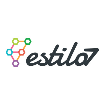
I don't get what the chemistry diagram is supposed to represent. I would at least think if the number 7 is in the company name, there would be 7 hexagons, as opposed to 5.
I think the hexagons aren't supposed to represent chemical symbols, but represent networking. And if you look at the way they're connected and the colors that connect them, those shapes connected with pink bars spell out an "E" and those with orange bars form a "7".
I didn't see it at first, with all the other colors it's pretty jumbled and hard to discern. If the symbol was reduced to three colors it would be a lot more obvious.
As for the typography, the word "estilo" is very nicely rendered. I especially like how the end of the "e" makes a little hook on the "s", and the top of the "s" stops short. My only problem here is the "7". All the other letters are connected but they're fluid and nicely spaced. There's no reason to connect the "7" to the rest of the letters, and the way it's done it just looks tagged on and smashed into the word.
I'd make the 7 larger, and have it descend below the copy a bit.
Here's a 5 minute little sketch to show you what I mean... forgive the sloppiness, like I said it's just a little sketch:
4 Comments
http://25.media.tumblr.com/tumblr_m5t96wYgDO1rwcc6bo1_500.gif
Way too many colors in the logo and i don't see how this logo showcases the company.
I don't get what the chemistry diagram is supposed to represent. I would at least think if the number 7 is in the company name, there would be 7 hexagons, as opposed to 5.
I think the hexagons aren't supposed to represent chemical symbols, but represent networking. And if you look at the way they're connected and the colors that connect them, those shapes connected with pink bars spell out an "E" and those with orange bars form a "7".
I didn't see it at first, with all the other colors it's pretty jumbled and hard to discern. If the symbol was reduced to three colors it would be a lot more obvious.
As for the typography, the word "estilo" is very nicely rendered. I especially like how the end of the "e" makes a little hook on the "s", and the top of the "s" stops short. My only problem here is the "7". All the other letters are connected but they're fluid and nicely spaced. There's no reason to connect the "7" to the rest of the letters, and the way it's done it just looks tagged on and smashed into the word.
I'd make the 7 larger, and have it descend below the copy a bit.
Here's a 5 minute little sketch to show you what I mean... forgive the sloppiness, like I said it's just a little sketch:
I see it now. But still, its a bit garbled.
I sketched this out, it has 7 hexagons, and it is an E. No 7 in the shape now, but...