Felipa Fashion Design
Georgie | Thu, 01/29/2015 - 00:00
Brief from client
This Logo is for a young lady starting her own Fashion business. Felipa is not her name, its just a name she's in love with. She wanted to incorporate a flower. I appreciate your comments.
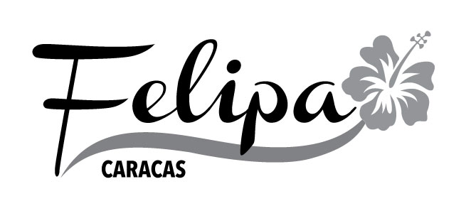
This logo is going to have color (purple & grays) and it is for all kind of deigns (shoes, bags, belts, dresses, etc)
6 Comments
I'm glad you mentioned the color, because that was going to be my first comment. :P
I like the overall look of the font and flower. I think it gets the job done for what it is. The only thing I'm not a fan of is font you chose for "caracas". The whole design is very "flowy" for lack of a better term, and that font is just kind of a blemish on an otherwise great logo.
I would personally recommend a font that kind of matches the style, like Pacifico(http://www.dafont.com/pacifico.font), or just a more thin sans serif. maybe even arc it with the line, that could be kind of neat.
Like I said, other than that, I like the logo alot. Nice job.
Thank you for your comments, great help. I did try the Pacifico font, didn;t like it, didn't match with the overall design, but I changed it to Myriad, much better. How do you like the color?
I like the purple. Truthfully, I would lose the gradient and just use a flat color. I also liked Felipa in black more than I like it in the gray.
The caracas looks way better. :)
It's nothing groundbeaking but I find this logo pretty nice. The main font flows very well and works with that swoosh.
I'm not a fan of the flower, though which looks gimmicky and art clip-y. The argument "the client wanted a flower so i put on there" is a bit short. You're supposed to tell the client what he needs =)
Also, I'd find another font for the subtext. Myriad is the default font for Illustrator, it's pretty bland and seriously lacks character.
Keep it up!
Ok, great comments, as Shawali said, I did convinced the client to stay away from the flowers, we decided to omit Caracas, and make much simpler, no gradient, just flat color for the purple
Make a new post with this one so it can get a lot of green thumbs =)