FIFA World Cup Russia 2018
BOPOTA | Thu, 04/23/2015 - 08:03
Brief from client
blah,blah,blah
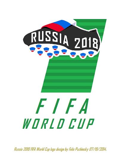
Another version on an entry logo for FIFA World Cup Russia 2018. This design not only include a previously posted soccer shoe with 11 heart shaped at their bases representing 11 host cities - but a soccer field with 20 stripes in regards of the 20 previous World Cups being played. As you look closely - you will see that a combination of a shoe/soccer field/title below is in a shape of a number " 1 " symbolizing a first ever global soccer tournament to be played in Eastern Europe.
9 Comments
look mate, I'll be frank with you after all the bull you spoke to everyone who's tried to tell you nicely. Your shit isn't going to cut it. Atleast take a look at other olympic/world cup logos before you go on with another bull%^& shoe. A shoe does not represent the sport ffs.
Your logo needs to capture the heart of what you are branding. And be nice to the people who're here to help you!
and here is an example of the worst Olympic logo ever made for 2012 games in London.
and another World Cup logo - the worst ever made for 2014 Brazil
other world cup logos you said at least to take a look... okay, mate, here is one that FIFA chose for 2018 Russia.tell me what you see there.
That is clearly a spoof. A hilarious spoof mind you, but a spoof.
To be fair though, it does represent soccer better than a shoe.
what's funny is that there is " IF " inside " FIFA " - LOL I rest my case, can't stop laughing...
why is it funny??? it's an abbreviation for : Fédération Internationale de Football Association.
now about your logo, the color doesn't work, the design itself doesn't work.
the shoe isn't a great idea for a world cup design
darkreixor, if you like that FIFA logo from a " Daily Telegraph " - I have nothing further for you and feel very sorry for you.