Fish Studio
danieleaq | Fri, 08/29/2014 - 00:17
Brief from client
Is my new company of graphic and web design.
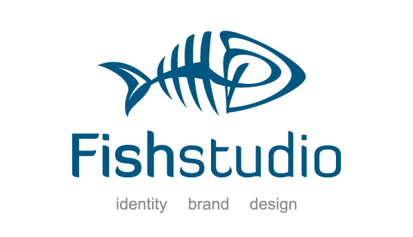
The logo is a fish bone, the head is made of D and P overlapping, my initials. My nickname is Fish since I was child so I decided to call my company fish studio.
4 Comments
BEAUTIFUL, I LOVE IT... Well done!
Just some food for thought...
I really like the symbol, but in regard to your typography, the f in Fish is the only thing capitalized. I would throw a lower case on that, for consistency sake.
That's all I got. Good work!
I love the the idea, the typo goes really well with the fish. Have you tried other colors so the fish would not have the same color as the lettering? just an idea
Love the fish..! I would take the time you took with the fish and work a custom font out.
Not feeling the Diavlo font.. I do feel a Handwritten Style could rock this out.
Have a look at Bounce script from Letterhead Fonts to get an ideal of what I am thinking.. not sayin that is the font to use, just from first thought is something I would fashion from and create a custom.
Lighten that tagline weight and tighten up closer to the Type.. balance "imo" isn't always good, especially with a vertical "top" icon and tagline.
Clever mark..!
V.