Brands of the World is the largest free library of downloadable vector logos, and a logo critique community. Search and download vector logos in AI, EPS, PDF, SVG, and CDR formats. If you have a logo that is not yet present in the library, we urge you to upload it. Thank you for your participation.
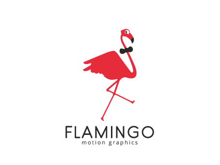
I like, although there are settings to do here, I see the back of the bird a little triangular, I think it should be more curved, I see the same in the head of flamenco.
The tail gives me the feeling of seeing a hand with two fingers raised.
The colors are fine.
I support your general idea of making a flamingo a symbol. However, there is plenty of fine tuning and polishing on a bird. Good that you posted a photograph here, so, you can see that a flamingo's beak is very unique in shape and not to be mistaken for a condor or vulture. Cesar, brought a very good point of the bird's body that looks very triangular and has that image of a hand with two fingers - that needs work. I even thought of the bull from Red Bull brand when I saw it at first... I agree with Waffles on legs proportions, too. I , also, see a number 4 made of legs crossover - is there a hidden message? Anyhow, fixing a bird, making more dynamic and elegant would only add into your solid concept. Good luck!
Good start, this is fun and I like it. The bow tie is a nice touch though I think its shape could be a little better defined. The sly sideways glance he's giving us is cute and adds personality.
I think the subcopy is just a bit too close to "FLAMINGO", give it a little room to breath.
I agree with some of the above comments, the bird needs some refinement. But you're definitely on the right track.
I agree with Cesar's comment about making more of an emphasis on flight. Given this is a motion graphics company, it would certainly reinforce that if the wings were more spread.
I'm also not sold on the bowtie. It looks like it's big enough to choke the poor guy.
8 Comments
I like, although there are settings to do here, I see the back of the bird a little triangular, I think it should be more curved, I see the same in the head of flamenco.
The tail gives me the feeling of seeing a hand with two fingers raised.
The colors are fine.
thank u cesar for ur comment but i made the back of the flamingo like he is running and this is its wings
Maybe you could extend a little more wings to see that feeling of flight.
i really like it, the subtext could be a little bigger though :)
Fun fact of the day: Flamingos are actually gray, not pink. Their feathers turn pink over time due to their diet of shrimp!
Fun critic of the day: I think this is fun, but I think your flamingo needs larger feet to help show that it is running.
I support your general idea of making a flamingo a symbol. However, there is plenty of fine tuning and polishing on a bird. Good that you posted a photograph here, so, you can see that a flamingo's beak is very unique in shape and not to be mistaken for a condor or vulture. Cesar, brought a very good point of the bird's body that looks very triangular and has that image of a hand with two fingers - that needs work. I even thought of the bull from Red Bull brand when I saw it at first... I agree with Waffles on legs proportions, too. I , also, see a number 4 made of legs crossover - is there a hidden message? Anyhow, fixing a bird, making more dynamic and elegant would only add into your solid concept. Good luck!
Good start, this is fun and I like it. The bow tie is a nice touch though I think its shape could be a little better defined. The sly sideways glance he's giving us is cute and adds personality.
I think the subcopy is just a bit too close to "FLAMINGO", give it a little room to breath.
I agree with some of the above comments, the bird needs some refinement. But you're definitely on the right track.
I agree with Cesar's comment about making more of an emphasis on flight. Given this is a motion graphics company, it would certainly reinforce that if the wings were more spread.
I'm also not sold on the bowtie. It looks like it's big enough to choke the poor guy.
Other than that, simple and to the point.