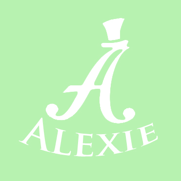
FotoAlexie
Brief from client
portrait/wedding/event photographer.
i hope i'm not an idiot for this description, i just want sone hel.
portrait/wedding/event photographer logo.
words to describe photographic style: classy, fun, artistic.
goint trough a change of vision and learning a lot so i'm changing some of my branding. the logo before was "fotoalexie", same font, just that the big A was in the middle and "foto" and "lexie" were on each side. just wanted to make it more discreet and recognizable.
not so sure about the colors. before i used a very light peach tone for the background and a very deep dark burgandy for the text and other elements. i like it simple with just 2 colors and max 2 fonts.
the colors i chese now i'm not sure about them. i just wouldn't like bold ones.
the way i speak to clients is very fluffy, overbearingly polite and caring, explaning everithing.
the hat stays (the one on the capital A)
thank you if you read so far.
1 Comments
I think you need to keep the foto in there so people understand you are a wedding photographer. I don't care for the arched type that gets smaller toward the left. I would suggest you do straight type across the bottom and see if that works. As for colors, this shows as white on a light green background. Um. No. Since you are referring to weddings, perhaps black and white is the best.