FU-YUAN medical & biopharma association
easonzhadous | Mon, 12/11/2017 - 19:19
Brief from client
this is a group of medical team, which was combined by doctors, pharmacists, nurses, dietitians and other professionals.
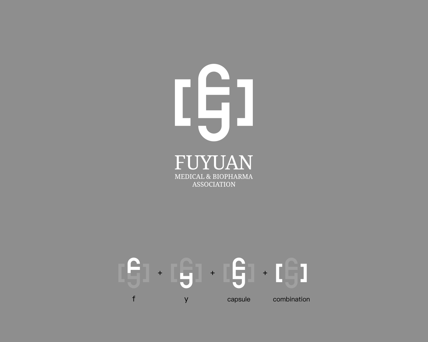
I want it looks steady and professional.
The symbol's ratio is 1:1
14 Comments
Just because you can put some letters together and make something, doesn't mean it will look good. And this symbol is very odd to me. The wording below it looks more professional by itself than with the symbol.
Unless it is really clever, it doesn't work- anyone looking at this could see a L, U, E etc- and your breakdown on how it's made won't ever be present when anyone looks at this logo- keep that in mind.
I say work on a great typographic word mark, and let the symbol go.
Maybe just because your taste wasn't good enough to comment this work, have a nice day:)
Please don't get defensive. You posted your design on here for people to comment on. They have taken their time to respond to try to help you. It doesn't take long on here for people who don't like criticism to be ignored.
My taste is just fine thank you- seems a few people agree with me too. :)
I'm sincerely disapointed with your attitude right now.
You've been posting awesome logos for a while now and always got the props you deserved. But now that you get a bit of negative feedback, you get all worked up.
The Critique Section isn't about flattering one's ego and now with that direspectuful comment, I fear that's what you were in for all this time.
Now, an apology to Joy might be in order. I hope this was a one time incident.
I'll leave my comment on the logo bellow.
I learned a lot from here, from many wise people.
I'm really thankful for that.
This is not my first time to got a negative feedback, I 'll always humble and thinking about those feedback, they push me better.
however, I can easily distinguish what is the GOOD negative feedback, and the BAD negative feedback.
This guy tried to teach me something really basic stuff, It's OK actually.
But when I saw his works, I knew he dosn't get any ability or talent.
Sorry for my words, But it's ture.
I'm uncertain about typography, but I think the symbol is totally works.
so when he say something about the symbol, just like I'm a middle School student, I won't take it.
I apologize for this time to everyone, it won't happen again.
Thanks.
But when I saw his works, I knew he dosn't get any ability or talent.
Sorry for my words, But it's ture.
I certainly hope this wasn't about me----- who is a FEMALE first off. And I certainly don't appreciate your comment about no talent/ability- and I don't think anyone else on here would appreciate that either!!!
Maybe you think your being talked to like a middle schooler because that seems to be your maturity level!
This is a pretty pathetic excuse for an "apology" but no skin off my back- at least I CAN SPELL! lol
So, in my finest southern accent- "Bless Your Heart"
Sorry that just looks like you saw an impressive dribbble presentation and injected it to support a poor design. The logo is very weak in that its open for too much interpretation. The brackets you used even made me think it's for photography instead of medicine.
You are not going to be around to explain it everytime. And I can't read any text when compared to that gigantic mark.
My typography is a thumbs down too, but I clicked up by mistake and can't change it anymore
I'm not that opposed to the symbol, I like the F-Y combo in the capsule form, but I think it could use some refining and the brackets are unnecessary.
It's the typography that bugs me. I don't mind the choice of Times or whatever look alike that is, but you can't always just kern type into makeshift ligatures. When you have a font with a dip where the serif meets the stem and you butt them together it makes an awkward wavy jumbo serif. I would suggest fully customizing the type if you are going to use this approach, or pick a font with flat serifs if you're not that comfortable modifying the first one.
I really like how you put it all together. I think you've got a clever logo as a start here. Are those brackets for the biopharma part or it's some kind of I.T. combo too? I have to commend the way you separate the parts under the logo.
Although I like idea, only thing I don't like is your attitude. You can still defend your logo's credibility but don't judge someone else's opinion.
Remember, this is a critique and not all of suggestions given to you are positive. This community is here to help who are in need of opinions and good judgement so fix your attitude first before your logo.
I'm not even sure how to critique this now,
Because there is nothing more I hate than a designer who personally attacks someone giving a fair critique.
Its one thing to say "I disagree", and give a reason as to why. You are more than within your rights to defend your design, god knows I do on everything I upload.
But attacking Joy's taste over the fact your symbol is in fact a tad convoluted, and could use some trimming down, was immature.
I think the symbol works. It shows how you can use letters to shape up a symbol as long as you know what you're doing and you don't expect people to read it. By that I mean that a symbol shouldn't be read or be as informative as it should simply leave an impression ans stay in people's mind. For one, I think that exactly what your symbol does. iGFX.Inc could learn from this ;)
Now for me the main problem is that I don't see a real visual connection between the symbol and the font work. I don't think a serif is the best choice here. It feels totally disconnected from the modernistic and streamlined symbol.
This is off to a pretty good start and deserves to be worked on some more.
i see an "E" and "G", not the letters you highlighted below. cool design. needs to be pushed further.