I need opinions please: Logo
Wizarts | Fri, 05/06/2016 - 16:32
Brief from client
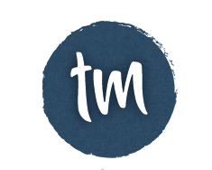
Hey all, I'm creating a logo for myself with my name initials (T-M).
Business: Design.
Name: TM
So, if you can, please give me your critiques, It will help me ALOT.
Thank you in advance all!
7 Comments
I like it! simple yet very pleasing on the eye! i think it would be good if instead of creating the blue circle with what looks like the brush tool you actually paint some blue circles, scan them in and use them, you could try all sorts of different colours and shapes to help give it that personal touch. you could even have a load of different ones in different colours and depending on what project you are working on use one that fits in with the same colour scheme for example just to mix it up a bit so that people arent constantly seeing exactly the same logo but the TM will still remain the same
Uau, thank you for the wonderfull review and the awesome ideas. I will try them =)
Simple and interesting. The T looks like a sword :)
Why there are 2 of them? Are you going to use a tagline?
I didn't see that sword haha! hmm interesting. The colors change slightly between them, i can't decide which one to pick ^^.
Maybe later i will insert a tagline, i don't know yet if i want to keep it like this
What do you think?
I like the general simplicity of this logo as well as the cool font.
But what's really bugging me to no end is that the first thing I saw was the Illustrator preset brush that you used for the edges of the circle. It really shows and for me it's killing the whole thing. It just makes your logo look amateurish. Never use these damn brushes! =)
Also, not a fan of the drop shadow behind letters. It makes the logo a bit dated. We are in the age of flat design! =)
If if you fix these problems I pointed out, you'll have yourself a nice simple signature mark.
Keep it up!
Hello there, Thank you alot for your review, i will try your suggestions and see how to it goes! =)
I'll post it here the evolution.
Thank you
So i made this on your opinions, which I am very gratefull.
Modifications:
Background color: Chose blue, may change depends on service, but that's ahead of this stage,
Background effect: Made it vector instead of effect (Texturizer)
Stroke: made simplier and none automatic from illustrator.
Removed shadow for the letters.
---------------------
What do you all think? Should this be the final version? =)