Brands of the World is the largest free library of downloadable vector logos, and a logo critique community. Search and download vector logos in AI, EPS, PDF, SVG, and CDR formats. If you have a logo that is not yet present in the library, we urge you to upload it. Thank you for your participation.
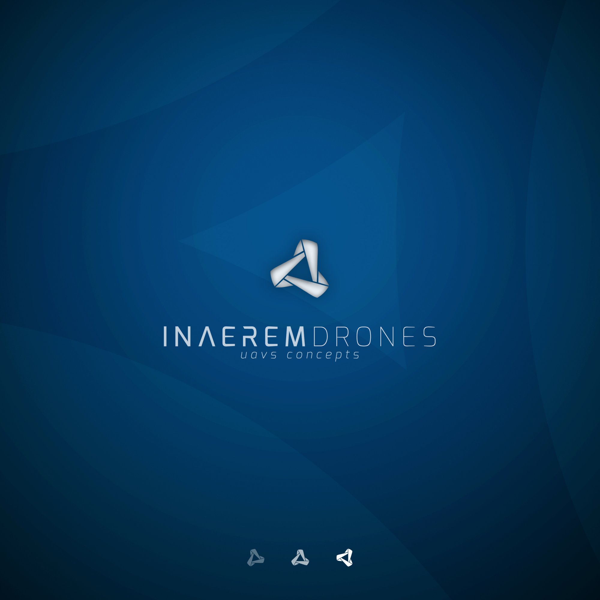
I kind of prefer the previous central drone symbol. Seems a bit more unique and makes sense for the brand. This one isn't BAD, but it feels more generic than version 2.
What if you try a symbol that is on a background and then incorporate a symbol from version 2 into each inner corner in a manner that is flying away from it, hope that I explained well enough...
I still like the first version best and the inner/outer shadow thing you have going on makes everything look fuzzy. The clean, white, crisp 1st version stood out much better. As I mentioned in the first version I work for a defense contractor and they are military/engineer types, they would snap the first one up, show them an abstract concept and next thing you know you have meetings and committees (and committee meetings) all telling you how to make it "look right".
Just curious, what are your thoughts on the inner/outer shadow fuzziness that bugs me. More a question the OP should ask but I wonder if I'm the only one that finds this very distracting, I don't think I'm misdirecting them, just curious.
12 Comments
contrast
Nicely done, much better version!
By the way, good to see you again here Felix.
Thank you, Cesar. Now I got two pencils - how about a pencil sharpener, too?
I kind of prefer the previous central drone symbol. Seems a bit more unique and makes sense for the brand. This one isn't BAD, but it feels more generic than version 2.
Yes, I agree the symbol is nice but version 2 is better at least in my opinion.
What if you try a symbol that is on a background and then incorporate a symbol from version 2 into each inner corner in a manner that is flying away from it, hope that I explained well enough...
I still like the first version best and the inner/outer shadow thing you have going on makes everything look fuzzy. The clean, white, crisp 1st version stood out much better. As I mentioned in the first version I work for a defense contractor and they are military/engineer types, they would snap the first one up, show them an abstract concept and next thing you know you have meetings and committees (and committee meetings) all telling you how to make it "look right".
My favorite version so far.
Just curious, what are your thoughts on the inner/outer shadow fuzziness that bugs me. More a question the OP should ask but I wonder if I'm the only one that finds this very distracting, I don't think I'm misdirecting them, just curious.
I personally like it. I would have a flat version on the ready just in case.
I can already see the little majigger rotating away on a loading screen. I like it! (and I like the white version better)