J. De Sena - Gardening & Handyman Services
M@ | Wed, 05/06/2015 - 17:56
Brief from client
Was left to my own devices
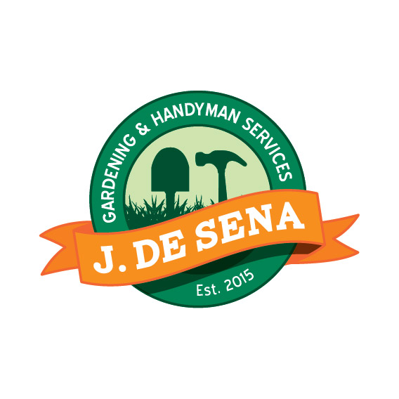
So yea i didn't have a brief for this, was just told to "Come up with something" I know... great huh?!?
So this is what i came up with! i like it but im not too sure about the symbol in the middle of the circle, it portrays gardening and handyman by the use of a shovel and hammer but yea if any of you have any thoughts about this please let me know! thanks :)
5 Comments
On the right side of the orange banner where it folds backwards, the shape seems to continue further than it should, visually. Might consider tweaking that.
The shovel/hammer standing side by side seems a bit boring to me. The grass silhouette is fine, but I would rethink the rest.
The "EST 2015" doesn't seem to match the rest of the text in the ring. Maybe make it all caps?
Meh, this feels rushed and the lack of brief is showing.
I know you can do way better than that =)
I like it! It stood out to me as a thumbnail with the other logos here. The orange pops from the green nicely and it looks professional.
It does kind of look like the hammer is protruding from the grass, which is a little odd. Maybe lose the grass altogether?
Don't accept any brief-less commission. If the client doesn't provide you with any info, ask him these few questions, telling him he'll have far better logo if he answers them: http://www.designfollow.com/design/logo/16-questions-ask-designing-logo/
The grass doesnt seem like grass to me(more like nails). If you are on cc use the curve warp tool and the width tool. You can come up with a patch of grass in 5 seconds. Also The shovel needs some additional points along with the sides connecting to the curve.
Other than that good design.