K-Nine Country Club
JonAtkinson | Thu, 05/05/2016 - 20:52
Brief from client
This is for a new business opening in my area that is sort of a spa getaway for dogs. The client was interested in seeing something with a country club feel but was also open to any ideas I may have. This one is of the later. I'll post a proof sheet of some other versions I worked up below.
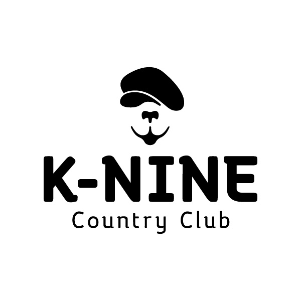
This version is a smiling dog's face wearing a newsie style hat,
8 Comments
Some other versions I'm working on
I love the work!
I cannot but compliment the neatness and the font choice.
I could not figure out the dog without reading. I thought it looked like a camel.
I like the bottom choices, it is so country club look and feel and I like the usage of the bone and the bowel.
Thank you. I definitely spent a good bit of time with font selection. I've already gotten a couple of mentions about the dog so I may have to ponder that one a bit more but it was a fun concept to play with.
Sketches...
Nice work!
I love the idea. However, it could use a bit of refining.
The dog's mouth looks a bit like a goatee. Perhaps because the tongue is merging into the lips too much, hence the red thumb. Other than that you're headed in the right direction.
I'm not completely sold on the tagline's font. The contrast between the two is too stark, but I do like the main font. I'd also make the symbol larger, since "K-NINE" appears almost as tall as the dog.
Other than that, great job!
I love this! I actually love the bottom 3 in your choices. I actually got the dog symbol right off the bat- he's like a dog- golf caddy!!! I also like that you brought elements of your tagline font (like the curl of the "u" and "n") up into your main font. Nice touch!
The round version may be a little on the hipster side, but all 3 are very well done and appropriate!
Good work!
The client picked the top right version. I liked some of the others better but it was the one that was more in line with the client's vision.