La Colombiapp
joseleaponte | Mon, 03/30/2015 - 07:38
Brief from client
This app is designed for the Colombian people living in the US, who are hard of native language (English), in this application Colombians can interact with one another, creating jobs and friendships.
13 Comments
Jose, qué tal.
I am from Colombia, here are my comments.
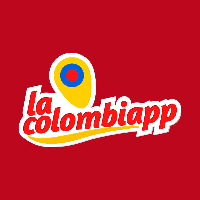
I wish there were more properties to chose from because your execution is flawless.
I really like the details you did: the subtle bevel on the white outline; the top solid shadow in darker red; the white outline is very even around the whole logo, something difficult to accomplish with curved glyphs.
I like the idea of making the logo kind of folkloric but in doing so I think the app loses credibility as a technological product. I would do something a bit more 'techie'.
The symbol resembles an uneven bull's eye rather than a map pin (I'm assuming is a map pin).
The playful feel (typography + colors + symbol + inclination) makes it look at a glance that it's a snack, or a restaurant. On that note the symbol could be confused for a potato chip, just saying, that's what comes to my mind.
As far as the colors, I really like the background red, I just wish that the logo itself used more grays or blacks with subtle blue and yellow accents to tone down the 'food' feel to it.
I did a backgwards image search, and this is what it's out there that Google thinks is similar: http://goo.gl/6ssXj3
Good job.
Here are some preliminary views and in the application, you're right tends to look for food. That I have very clear.
For the app icon you should maybe just have the marker instead of the entire logo, that would look more appealing on a small icon for phone. Other than that i like
Your isometrics look awesome Jose.
The red is very, very nice, it brings home the brand. I really like it.
Regarding the app icon, consider this from iOS Human Interface Guidelines:
"Embrace simplicity.
In particular, avoid cramming lots of different images into your icon. Find a single element that captures the essence of your app and express that element in a simple, unique shape. Add details cautiously. If an icon’s content or shape is overly complex, the details can become confusing and may appear muddy at smaller sizes."
https://developer.apple.com/library/ios/documentation/UserExperience/Con...
Gracias ricardo, no sabia lo del icono de apple. Saludos
For the app icon you should maybe just have the marker instead of the entire logo, that would look more appealing on a small icon for phone. Other than that i like
Looks nice, except for the symbol. It looks more like a grain of corn rather than the usual google maps type thingy. I would fix that and your logo will look better.
I know, thanks for the constructive comment.
Joseleaponte Hello greetings from Colombia, I like the logo, I think we can improve the location icon.
Something like this to give better sense.
Cesar's map pin design is spot on. Buena esa mejo :) [that's 'Good one brother' in Spanish :p]
--- Dang! this thing does allow me to change my red votes or delete my post o_O. WTF. Sorry, I don't mean to downvote this.
Yeah, I don't agree with how the voting system is handled, either.
Gracias por tu comentario. Saludos César.
Great job, the entire logo has a very nice feel, dynamic and fresh.
But I have two little observations: the red on blue dot is a bit of an eyesore, maybe try and put a white circle between them.
And second, I'm not really sure about the little gap between the two "p" letters. It would look better if you keep it full white, to contrast with the white space between "la" and the symbol.