Las Hebras
acubero | Wed, 12/14/2011 - 04:01
Brief from client
"Las Hebras" (the yarns) sounds is Latin American Spanish exactly as "Las Zebras" (the zebras). So, we want to use that game of words somehow, based on the notion that we produce yarn-based products. Being our company founded and operated by gay people, we want that to be represented in the logo, as well.
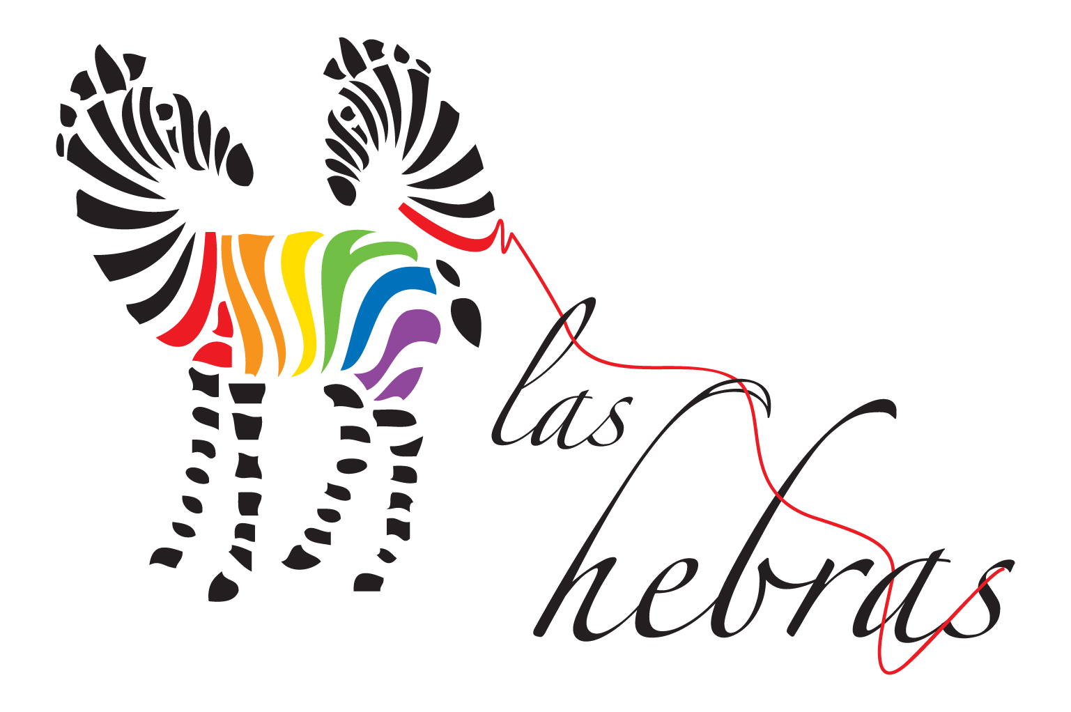
We decided to represent a couple of zebras apparently embroidered (or made of yarn) where one of them was already complete and the other one was starting to form. The colors of the gay flag were put into the body of the complete zebra, while the loose yarn of the second zebra was passed through some of the letters that seemed needles. The yarn along with the "H" were put in such a position that resembled a subliminal "Z".
6 Comments
I don't think the colored stripes on the zebra work. ALL of the black ones are uniform, so when I see the different lines in color, I try to read it- definitely looks like a negative space "A" at the beginning (red and orange) then the green looks like a "Y" and the blue looks like an "i" with a black dot. Could read "Allyis"...
This may also have to do with the font you are using. It's so weak that your eye jumps over to the color which looks like letters. I see why you used it- for the similarity to the eyes of needles- but it isn't working IMHO. I would make the colored stripes like the black ones.
The unraveling effect you are going for doesn't work for me either. Probably because right now the zebras don't look embroidered. If they were made of lots of thin lines it might work, but you have to do it right or it will get messy and/or too busy.
I get the use of colors from your brief, so I think it works.
SO... I think it's a good idea that hasn't been executed well- yet. If you work on it some more it should be successful.
ALSO- personally, I think the composition could be improved. Either by having "las" and "hebras" on the same line with the zebras smaller beside it. Or by making the text larger and stacking it -- left aligned the same height as the zebras.
Should be nice when it is finished, good luck. : )
I'm sorry but it looks like a logo that was done last week:
http://www.brandsoftheworld.com/critique/adell-designs-1
and he stole it off: http://alturl.com/w5z5t
which was done better and also the typography is very poor.
Start again and spend time on a concept and investigate into your typography a little further than a default script font.
Sorry.
Approvo il commento di 11Elevendc!!!
NON SI COPIA un lavoro già esistente!!!
It looks like the first zebra is turning its head towards another asking "why are you humping my ass?" (no offense, just a small pun). Typography is pretty bad and that thin red string tying typography and zebras is totally out of place.
The whole concept is badly executed and it just doesn't work.
i don't know what is this...and how it can works!!!!....i suggest that you drop this one..start another, find the concept, arrange your idea and start working...don't be disappointed because success is build by a lot of mistakes...
M egusta la idea, los colores representan los colores de los hilos y las curvas del texto simulan los orificios de la agujas,muy bueno, me encanto!