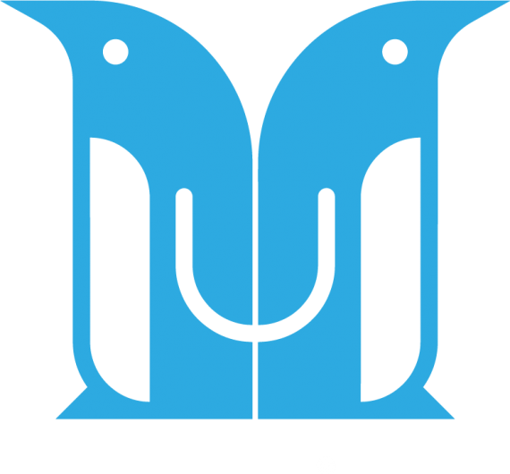
Logo for a shopping app service
unwarrior | Tue, 09/12/2017 - 09:24
Brief from client
We are a start-up with a unique service that brings benefits to retailers as well as their consumers. We want our logo to communicate this fact,and be simple enough to use as an appicon. Our initial audience is younger women shopping at lean times on week days. We will be launching in a small country with a very cosmopoilitan, internet savvy population.
I'd much appreciate some feedback on our efforts thus far.


10 Comments
I feel like this is a really solid symbol. I think the penguins could be spaced apart just a little bit more though; the spacing between them is very thin, especially at smaller sizes. Also, I would try matching the curve of the beak to the other curves you have in the symbol. If that doesn't work, maybe just use a triangle to match the shape of the foot. For the stroke in the wing, the circular end point doesn't look quite right. It could just be me, but I'd suggest making the end point match the curve of the belly/body, if that makes sense. Otherwise though, I'm really liking this so far.
I really like this symbol as well and just think it needs to be pushed a little further. The "U" in the middle feels a bit out of place to me. I am seeing a U in the outer stroke of the 2 penguins. Maybe that could be accentuated to be the U and you ditch the center one?
Could you clarify what you mean by the "outer stroke"?
I was seeing the blue line that starts at the beak, goes down to divide the white belly space from outside of the logo, and then curves toward the other bird by the feet. If you look at this line on both birds, it looks a bit like a U. It would take some experimentation, but I think if you accentuated that line a bit, it could form the U
I see what you mean. Thank you for the suggestion.
I think this is a nice idea. The U in the center feels a bit off. Perhaps going all the way down with the white cheast in order to connect that U? Perhaps this also would create some wings at the same time.
Well I am going to be "that" person and disagree with most everything said above! (with the exception of adding a little more space between the penguins- I think that is a good suggestion).
I really like this symbol- it caught my eye and then kept me there with all of the interesting shapes and the almost face it creates. That is what you want in a logo! Memorable! Effective!
I like the round end points on the center U curve- flattening them would make them look out place in this smooth logo.
I like the beak too- making that a triangle??? Nope- then they would have matching feet on their faces! lol
I will admit the curve under the beaks could use just a bit of smoothing out- its the one place I can tell where all the points on that line are. Your other curves are perfect so I know you can handle that.
The note about using the "outer stroke" for the U---nope also. I think what you have here works just fine and is more clever in the use of the "wing" to create it!
Color is fine and I think this hits the mark for the intended audience majority.
I guess what I am saying here is I dig this logo- congrats and good work =)
Nice! A bit more work on this and it will be a solid one. Right now I feel like the penguins dont "have each others backs" but rather is turned away from each other. Anything you could do to enhance the friendly feeling?
Yes I see what you mean - it does feel like they are upset with each other rather than protecting one another's backs.
Penguins huddle very close to each other, to protect from the cold and from predators.