Logo for a social network
mauraust | Thu, 06/23/2016 - 14:53
Brief from client
Hi i am seeking some constructive feedback for some variations of some logo designs. As per the site rules I will upload the varations via the comments section
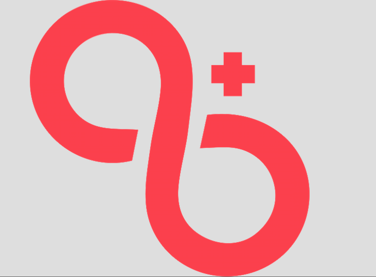
The Company is called 8+ and is a social networking platform for attractive people
Our brand persona is fun, flirty, exclusive, cheeky and slightly mischievous
Our target market is
Primary Flow-On Market
● 17-20 year old, female, single
● Interests include pop culture, celebrities, fame, beauty
● Positioned as the cool club, an elitist platform that not only delivers status
Secondary Market
● 18-25 year old, males, single
● Interests include fitness, health, nutrition, sports, music, fashion
17 Comments
First of all, you can't post more than one logo. If you have any variations, put them in the comments.
Second, there's no company name. It would help us out a lot if you included that so we can properly critique the brand as a whole.
Finally, Right away I would eliminate 1 2 and 4. Gradients and drop shadows don't work well for logo designs. That's not to say 3 is the best version, but I would use it as a starting point moving forward.
I can't really say much else without knowing what company the logo represents. Infinity Plus?
I got 8 + which seems a bit young for a club!
Hi guys
thanks for the feedback i will remove this
and create a new brief based on your feedback
As an 8+ myself i think i have authority to comment... ;) wink wink lol
Only version i remotely liked was the one you started with, version 1 in the top.
It's clean and simple.
Variation1
Variation 3
Variation 4
Variation 5
Variation 6
Felix would have a heyday with double imagery in these logos...
All the design work is being outsourced and nor my co-founder and I have any expertise in design so any feedback or rule of thumb/guidelines for logo design would be much appreciated.
the top image is the best, I like the way it plays off infinity symbol, but still not crazy about it. all those variations look "wonkey" to me/amatuerish. outsourcing is probably not the way to go. it pays to hire a pro. but I won't get on the soap box.
Definitely top image is the better of the rest. I do like how you kept things in order in there : 8 and then + . However, it does lean into a direction of a lower case " a " flowing into a lower case " b ". I believe that you off a good start, keep working on this logo - there is a clever solution to your general idea.
Seems a bit snobby to me...but hey, I'm a 9+ sooo. =) LOL
If anything I'd focus on the uploaded image only, it's a way better starting point than any of the rest.
This x1000. DO NOT continue with the other designs. Stick with the main one. This is not opinion. It is a universal truth.
I wouldn't continue with the top logo, it pretty much already exists and it immediately reminded me of the attached logo. Logo is from a band called "Life On Repeat".
« attractive people »
Pouuahahahaha! (seriously)
Sorry, but who decided who's is attractive ?