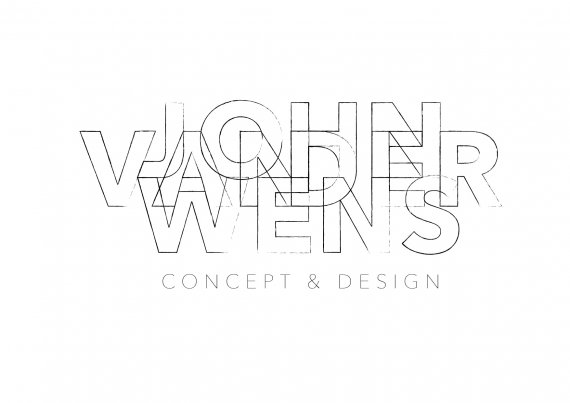
Logo John van der Wens
2m4 | Thu, 04/28/2016 - 12:08
Brief from client
Working on a logo for myself. I’m a mediadesigner for poetry projects.
At first I was just messing around with the avenir font, the blending options in illustrator and experimenting with readability. Then I found myself working on it as a new logo for myself. Although it still looks like a graphical exercise Im happy with the shape and the concept. Only thing is that I’m having trouble finishing the proces. I tried some hip bright colors, my own colors, outlines, etc. What do you think?


7 Comments
I think this looks really cool! I prefer this over the colour ones. Although this one is harder to read!
Perhaps putting some hints of colour in there almost like watercolour would look cool behind the lines and also help elevate the whole thing a little.
Love the concept though - good job!
Thanks for the feedback. I did some quick 'colour hinting' in a new version. It might work. What do you think?
New version...
I can sense some real design skills behind this logo, but it just doesn't work for me. Way too complicated and hardly readable. Your previous logo, though it wasn't perfect, was much more legible. http://www.brandsoftheworld.com/critique/personal-logo-media-designer
If it takes more than than a second to get what it means, then the logo isn't doing its job really well.
Maybe simply try to not make the words overlap.
Keep it up!
Thanks for the feedback. I'm trying to make a design that is like good poetry. Rhythmic and open for different interpretation. A risky goal for a logo, I agree. But hey! Maybe it works with a little feedback from my friends...
The newest version you posted is fantastic but, from an artistic standpoint, I really dig the rough penciled look this one has. It may not be the most applicable for a logo to use every day but damn it's cool. I could see this on a paper background with some eraser bits off to the side. cool work.
I agree with Shawali here. I can barely read it as a thumbnail. It's just not attention-grabbing, which is what you want to achieve with logos. Even closer up, it takes a while to fully understand what the overlapped letters are saying. Not a good trait.
This critique applies to the new version as well.