Logo re design
Maggie29 | Sat, 07/04/2015 - 05:19
Brief from client
The client wants the current logo redesigned for a small law firm.
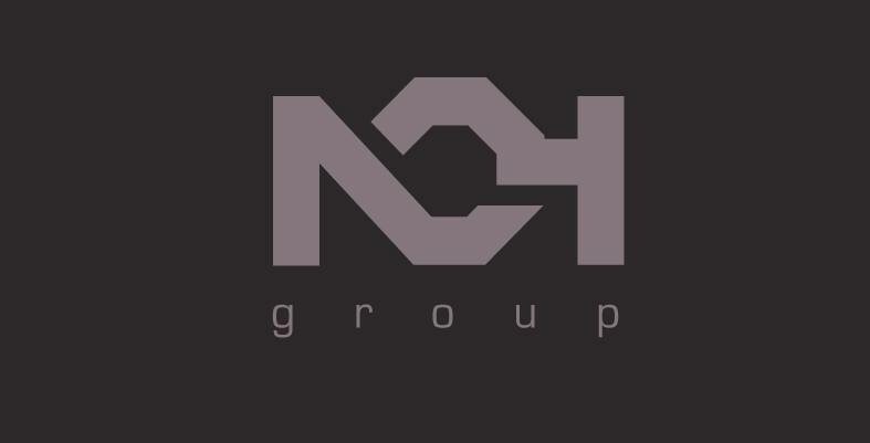
Hello, my name is Maggie. I'm re designing a logo for a small law company called NOH group. They want something contemporary but still cooperate.
Any feedback would be greatly appreciated.
7 Comments
Hello Maggie! Firstly, only one logo per entry on this blog. Secondly, your concept is not readable , it very hard to see what letter is in a center - almost look as my STOP sign on my school bus when I'm loading or unloading students. To some it may appear as a slanted " b " or even a " G "...That being said I would suggest to do more different sketches or even ditch this idea in favor of a totally new one, as this one will not work.For a typography " group " part is almost invisible, needs to be bigger. Good luck to you.
Thank you I appreciate your comments, I will do some more sketches as see what I can come up with.
I think that you can, still maintain a composition as it is... I would make an " O " round and not hexagon, as that shape uses mostly for construction concepts. I believe you can still make " N " and " H " curving nicely on each side of " O ". " O " could integrate into a gavel, which is a cool symbol for a law business.
I got NOH before I read the brief. My only concern is that looking at it in the preview page, I expected to see something from a mechanic or automotive retailer. The center O very much looks like an 8-sided nut.
I didn't think of it that way but it makes sense. Thank you for taking the time to have a look at my logo everyone. This has really helped. I'll work on a new and improved version.
Here is another version of my logo. I tried to do the o round but I didn't think it was working so I decided to try this shape instead. I also tried to I cooperate the gavel in to the logo but in the end I left it out as I wasn't happy with it.... I think this is readable now and I like it because it's very simple and clean. However I would really like to know what are your thoughts on this. Thank you in advance.
I like the first one!!!