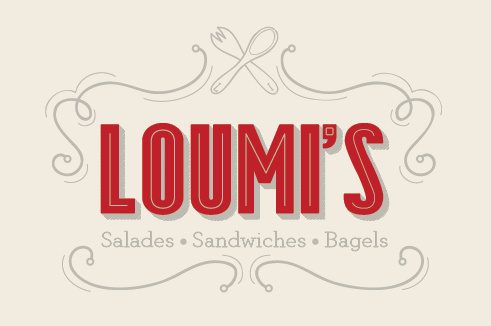
Loumi's (it's back!)
Shawali | Mon, 09/22/2014 - 17:55
Brief from client
Hey guys.
Some of you may remember that old project of mine, the rebranding of a restaurant in Paris that I've been working on and off for the last year or so. I've just learned that the project is back in full swing, the budget for it as been decided.
So I started exploring some ideas this afternoon. Here's one.


7 Comments
I like it a lot. It definitely conveys Paris cafe to me.
My only small critique would be the inline on the apostrophe looks a bit forced and not really connected with the inline spacing of your letters. I personally would either make the inline a small square dot, since the inline of the letters is a single stroke, or leave it off all together.
I love the movement of the logo though, The framing is really nice. Some of the curves on your frame look like they are getting a little cone-like. I would make some minor adjustments to curve them a bit farther. All-in-all, small tweaks, but it's looking great so far!
I think this looks great Shawali, but i have to agree with the above comments.... some of your curves are a bit "cone" like and im not sold on the colours.
I also prefer previous version that you done to this one. Could you post an image on here of all the different ones you have done to remind us please :)
=)
Thanks Shawali, My favourite Loumi's text out of all the ones you have done is the 3rd one down on the left. I think if you combined that text with the symbol from this version and add some of your decorative pieces you could have something great! all depends if your client liked the Loumi's part of that logo though
Loumi's Denim. The best pair of jeans for when you're ordering food! :D I get a Denim manufacturers logo feel off of your old logo's. My preference goes out to the 3rd circled logo on the top right. You could use one of the other shapes as coasters or as a nice outline for table cloths etc. Nice!
I just love the typography on this it absolutely suits a restaurant. The usage of line work and eating utensils are a bit overused and nothing new but thats not necessarily bad (if its not broken don't fix it right?) But the colors definitely don't fit here for some reason maybe if you tried a lighter shade of red you're using right now. or checked out the Kuler color pallete in Illustrator for possible idea's or shades. Keep at it!
This one has a nice balance of contemporary with classic. Some of your previous efforts on this project have caught my eye more artistically but there is nothing wrong with this version, aside from the apostrophe that has already been mentioned. I don't even really have a problem with the red. I do really love the straight black and white scheme you had but it sounds like you're getting more directive from the client now. Do I see an L and an I in the utensil handles?