Brands of the World is the largest free library of downloadable vector logos, and a logo critique community. Search and download vector logos in AI, EPS, PDF, SVG, and CDR formats. If you have a logo that is not yet present in the library, we urge you to upload it. Thank you for your participation.
Lumberworks
darkreixor | Thu, 04/09/2015 - 19:35
Brief from client
This is a only a test i might intend to release in the future, i need your inputs :)
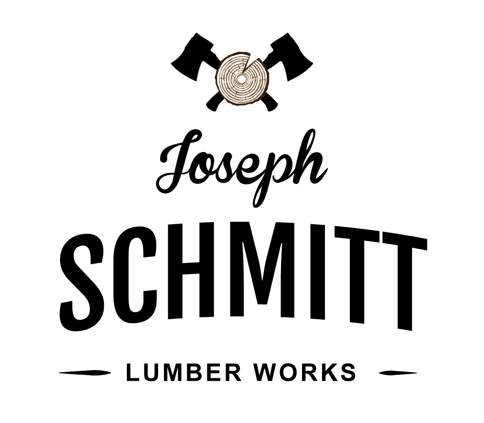
Here some ideas fir you project:
a) The Symbol is too small
b) The Typography is too big and its very separated from the symbol
c) You can combine the same colors from the symbol for the typography
Good start, I like the vintage style, thought it's a bit run-off-the-mill right now.
I'd get rid of the symbol. It feels a bit clip art-y and don't really mesh with the rest. Or if you really want a symbol, don't half ass it. Whole ass it =)
I red thumbed the font work not because the types, but because there's too many of them. I'm not a fan of the script one. The others compliments each other pretty well. I'd just keep them and let go of the other one.
Apart from everything said above, the symbol is a bit conflicted: you have the 2 axes that are only outline and the log, that has too many details. You should try and find some middle ground for this, and simplify the entire symbol.
5 Comments
I'd arrange it so your symbol draws a little more attention than your text. Currently, it seems like an afterthought compared to "Schmitt."
I'm also not a huge fan of using three different typefaces. At best, use two fonts that relate well when you involve the use of subtext.
The symbol looks nice, although a tad generic.
Here some ideas fir you project:
a) The Symbol is too small
b) The Typography is too big and its very separated from the symbol
c) You can combine the same colors from the symbol for the typography
Good Luck
Good start, I like the vintage style, thought it's a bit run-off-the-mill right now.
I'd get rid of the symbol. It feels a bit clip art-y and don't really mesh with the rest. Or if you really want a symbol, don't half ass it. Whole ass it =)
I red thumbed the font work not because the types, but because there's too many of them. I'm not a fan of the script one. The others compliments each other pretty well. I'd just keep them and let go of the other one.
Bonne chance!
thanks guys i will work on a 2nd version !
Apart from everything said above, the symbol is a bit conflicted: you have the 2 axes that are only outline and the log, that has too many details. You should try and find some middle ground for this, and simplify the entire symbol.