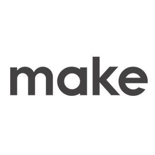
Make - Creative design agnecy
Gintautas Bružas | Tue, 10/31/2017 - 08:59
Brief from client
My client is me... my self.. And what you guys think?

It doesnt let upload more vizuals so here is the link of technical drawing:
https://make.lt/naujienos/make-logotipas/


14 Comments
Heres the blueprint :)
No offense....but I don't get the point of this?!? It looks like an over dramatic sketch to make this logo.....when this logo is so plain you could have gotten the same result from a ton of available fonts....even free fonts!
The logo has to stand for itself....you can't "prove" it with some fancy sketch.
Just my opinion =)
And why you think free font is better then original lettering? :)
and look at it in here: https://make.lt/ and tell me if it was or wasnt worth...
I don't necessarily think "free" font is better than hand made. I don't really need to visit your website either. I just don't see the point of the elaborate sketch to show a 4 letter wordmark that isn't really all that custom. It's just kind of gimmicky for me.
No one is going to see your sketch... they will just see the finished word mark.
But hey- it's only my opinion. Feel free to take it with a grain of salt =)
I see the schematic that suggests you created the lettering, but I also see a combination of Avenir and Fakt. For a creative design group, I am not convinced. it seems to be a lot of work for not much return.
Lettering is one of the dark arts the is very difficult to master. I like the idea you have here but the execution is off slightly. There are some things about font design that are counter intuitive, for example you have made all of the strokes the same width, Up strokes, side, curved and angles strokes fool the eye and will appear to be different weights if you create them the same. You have compensated in the shoulders but not the bowls, so the o and e look bolder. If your logo is going to be this simple and represent you in design, it needs to be flawlessly balanced and perfect to the eye. It's like tying to get hired as a head chef based on one bite.
Thanks for advices, but reason I made it same fat everywere is that it makes a little bit drama. It makes you look longer... I think :))
Boring and forgettable. For me a logo is best when it has some oddity that makes the audience remember it. And that is coming from someone who makes pretty bland logos.
I like the construction lines drawing better than the logo & think you should make THAT the logo :) Get rid of a few lines, keep the larger circles & play with colour/weight.
Then you'll have something interesting to look at with a strong concept.
I think you spent more time creating a very time-consuming 4-letter word when it's just 4 key press away from making it.
There is no purpose on your brief other than yourself claiming to be your own client.
I like the thinking behind this as I am a sucker for custom fonts. But I can only agree with others. The end result is plain and does look like any given free font out there. You just need to make it look more unique, give it some flavor.
Keep it up!
Well i truly like that you hate it. I think all worked as it have to work.
- it looks finished and not
- it is fat and slim same time
- it does make you think and look at it
- its trully that simple that you think that you can forget it but wen you see it next time you will reamember.
- this logo can be 5px tall and still visable
- it does have your attention :))
Thanks for all comments
Weird reaction. If you're so sure your logo's so great, why bother asking for feedback?
And I don't see what "hate" has to do with anything. If you confuse fair criticism with hate, then you have a lot of growing up left to do, as a designer and as a human being.
Yep :)