Mammoth Sound Productions
bkaul01 | Tue, 06/27/2017 - 21:40
Brief from client
New logo design for a sound production business. They had originally wanted rainbow lasers coming out the eyes of the mammoth like that of the Flaming Lips Dark Side of the Moon album, but I steered away from that for good reason.
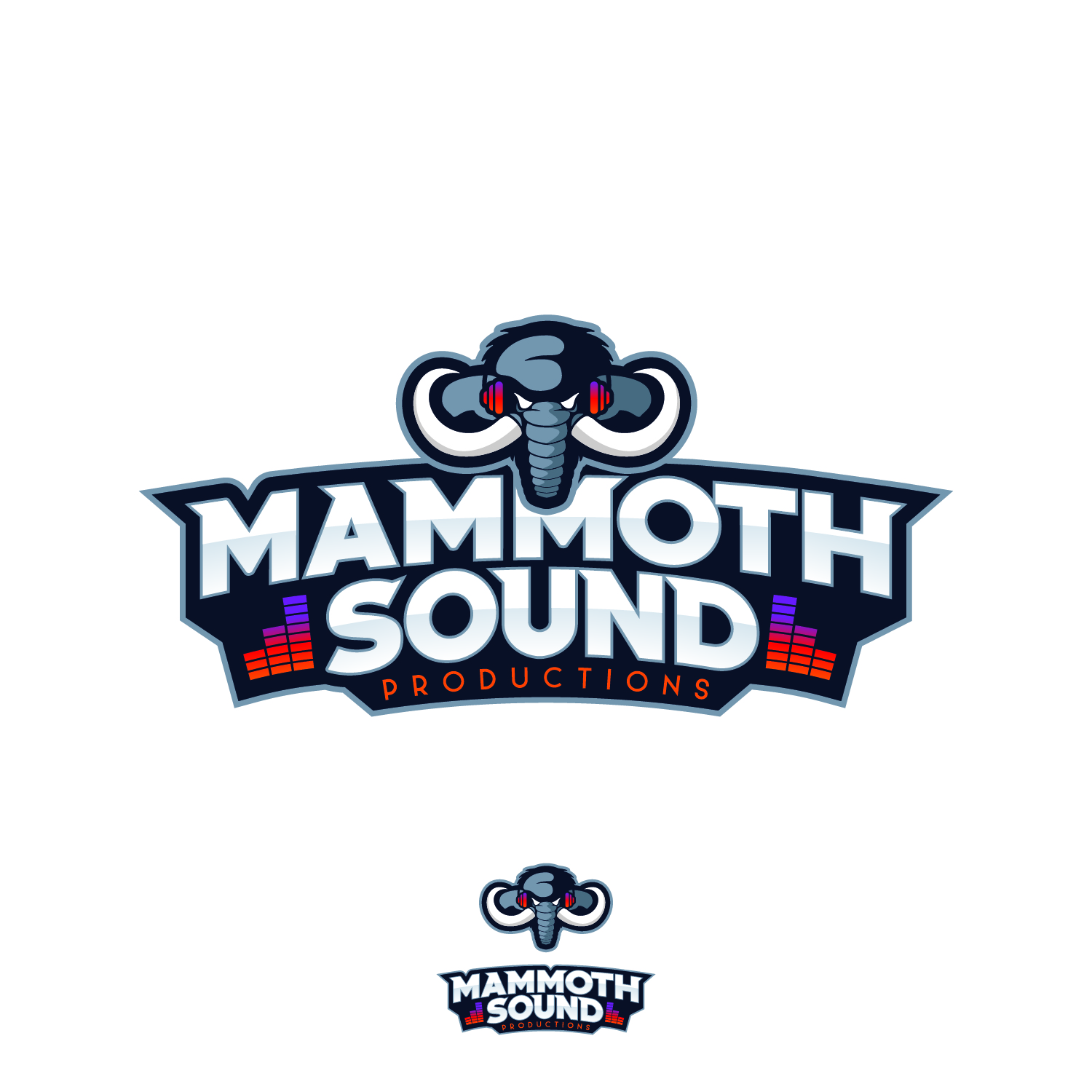
When I think of Mammoth I think of large and "In Your Face".
This is my reasoning behind the large boldness and colors of this concept along with headphones on the mammoth for obvious reasons.
Unfortunately the customer turned this down. Is there anything that you guys think would help with this? I'm thinking I might have to just come up with a whole new concept at this point.
10 Comments
My main concern here that it doesn't look as mammoth. There is an angry face with headphones and fangs coming out of it.
I wasn't joking. Your concept didn't convinced me enought to say with 100% that that is a mammoth and nothing else. I do see an angry face with a beret wearing red headphones and the nose being vibrated all the way down. And that is okay, as graphic design, because of how things are being stylized and modified, makes sees different stuff. By no means I'm trying to say that this is a badly done concept. I would let go sound bars, as they do not add anything to the overall design. I do not like how the trunk falls over the " M " and the font itself could be more vibrant and dynamic. Subtext is lost on that dark outline. To me the symbol feels more as a sport logo rather the recording studio.
.
This actually feels like a fresh, strong logo. It isn't perfect, but it has crazy potential.
I would start by giving the symbol more attention. The gaps between the head and tusks is a bit distracting. I'm not sure whether they're supposed to be ears or just a backdrop. The hair at the top could be more asymmetrical, and not jutting to the sides. I might even reduce a few lines on the trunk, the segments look a bit funny when separated like that fully.
But I really can't nitpick it that much, other than I'd like it to be much bigger! Show it off more.
For the text portion, the sound bars could probably go. No need to get too busy with sound imagery. I might also suggest adjusting your kerning. Some letters look closer than others, like the two Ms.
Have you tried experimenting with a black and white version as well?
Nice job overall!
I first saw the headphones as angry eyes, I had to read on to figure it out. I do like the start of this. A little work on the Mammoth, as Kills said, and I think you are golden.
I agree, just need to fine tune head a little more and mammoths are brown not grey but not sure if that's a huge deal if you are associating the word with size not the animal.
Oh as good as the Flaming Lips Dark Side of the Moon album is, Dark Side of the Moon will always be Pink Floyd...
I'm going to agree with the above comments, with the exception of "image-me". I, too, think this has great potential. I like the typography and the layout. I think "productions" could work in a lighter shade, or white. I also like the sound bars.
The mammoth is a good idea, it just needs some tweaking. I think the overlapping of the trunk would look better if the mammoth didn't have the pale blue outline around him. As said above also, the eyes/ears/headphones area is where I think the trouble is. At first glance, and with that bright red, a person could see those as the eyes, not headphones. If you work on that area of his head- this logo could be great! So keep at it! =)
Looks really cool to me. I'm digging' it!!!
Here is what available online already.
Okay but this looks nothing like his logo. Just because there is a sports style doesn't mean that they are one in the same.