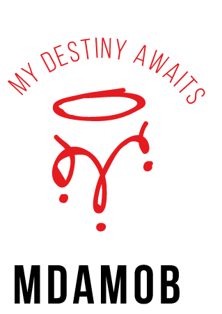
MDAMOB
Brief from client
I need a logo for a street wear brand
It has to be minimal, classic, timeless and resemble street art because it's mainly targeted to the youth, the funky, the rebel with a cause.

My Destiny Awaits (while I) MOBilize my craft whether it be Art, Photography, Graffiti, Sing, Rap, Dance and not so understood crowd to actually give them a place where they feel like I am part of a movement that pride it's self for pushing boundaries for a better tomorrow.
This is how I broke down my brief
I choose two distinctive colours to communicate the brands message Black and Red with a transparent background (preferably white) however the mood of the logo must blend through with any colour background as it will be t-shirts, crewnecks and jackets. Colour pallets for these items are close to infinity, whether screen printed or embroided it has to feel home
Since it's a street wear (fashion) brand I felt the are no boundaries it can be a tag, stencil or even a piece on the wall, so I took inspiration from the streets of Cape Town and East London graffiti. There was a lot I took however the end result was a crown which I purposefully turned up side down to resemble "M" for MDAMOB.
For minimalistic approach I used BEBAS NEUE bold font for both the tagline and brand identity.


6 Comments
I am having trouble figuring out which part is your logo? Nothing has any hierarchy here. Nor is anything centered. Right now this feels like 3 separate thoughts on top of each other.
And the stroke you used created those flat areas in the curves of the crown- that should be fixed, but try to keep a bit of messiness to it. This is the most interesting thing happening here.
This is not working at all as a logo tho. You need to combine and simplify!
Wow I really appreciate the honesty and the contractive criticism, thanks Joy am going back to the drawing board
I like the idea behind this, but it definitely needs much more time.
Right off the bat, I would ditch the top text, flip the crown right side up, and change the weight of "MOB" so it doesn't look like it is part of the acronym.
Think of how the text relates to the mark as a lockup, because it looks like it is randomly floating right now. Keep going!
Thank you very much I really appreciate you input I will take your advice into account
I like the idea and that symbol is pretty cool, but as Joy said you have big problem concerning the hierarchy of information here. The claim should n't be on top of the logo, as it drains much of the attention. That why we generally call that a sub text, as it comes under the wordmark. But as a rule of thumb, it's better to not have the sub text being an integral part of the logo. At least, in its basic iteration. But if you want to have it in there somewhere, make it discreet. The logo should still work without it.
I agree and appreciate your advice Shawali, if I may ask with regards to Typography with font do you thing will work here?
Perhaps Gotham?