Brands of the World is the largest free library of downloadable vector logos, and a logo critique community. Search and download vector logos in AI, EPS, PDF, SVG, and CDR formats. If you have a logo that is not yet present in the library, we urge you to upload it. Thank you for your participation.
Version history
Version 1

- I
- S
- T
- C


6 Comments
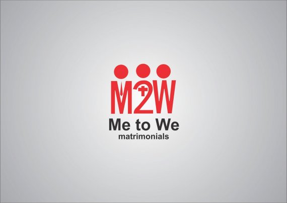
Nice idea but the symbol is too complicated, with all these bits and pieces.
The font work is very sloppy, the text isn't centered.
The space between the circles is uneven. Mainly due to the fact that W characters are usually larger that the M, which creates an unevenness in this occurrence. You maybe better off use a upside down M instead of the W.
Keep it up!
If I like the idea but as Shawali said, you have to make many adjustments to reach perfection.
continue working.
One has a tie to make it a guy, another a cross to make it a priest, the other has nothing. It looks like the 'W' is either just fed up with the entire thing and has their arms up in the air, or alternately that it is a lady with a very droopy bosom.
i agree with all the above, i think there;s too much going on!
The font looks too generic.
remember this: SIMPLE is ALWAYS BETTER :D
@Shawali: the text is centered, it looks off because of the W.
very good job! typography and style were very cool. Just need a little better in the symbol.
visit and your suggestion in my work ...
http://www.brandsoftheworld.com/critique/layout-idea-design
Here's an idea: maybe if you remove the red initials, and put the symbols directly on the text (remove the M, and put the head and the tie on ME) and see what happens. It should make it simpler.