Morilla Outdoor Gear
j.o.y | Mon, 02/01/2016 - 19:41
Brief from client
Client wanted to update their logo for an outdoor gear company (tents, hammocks, coolers etc) to something more "rugged, manly."
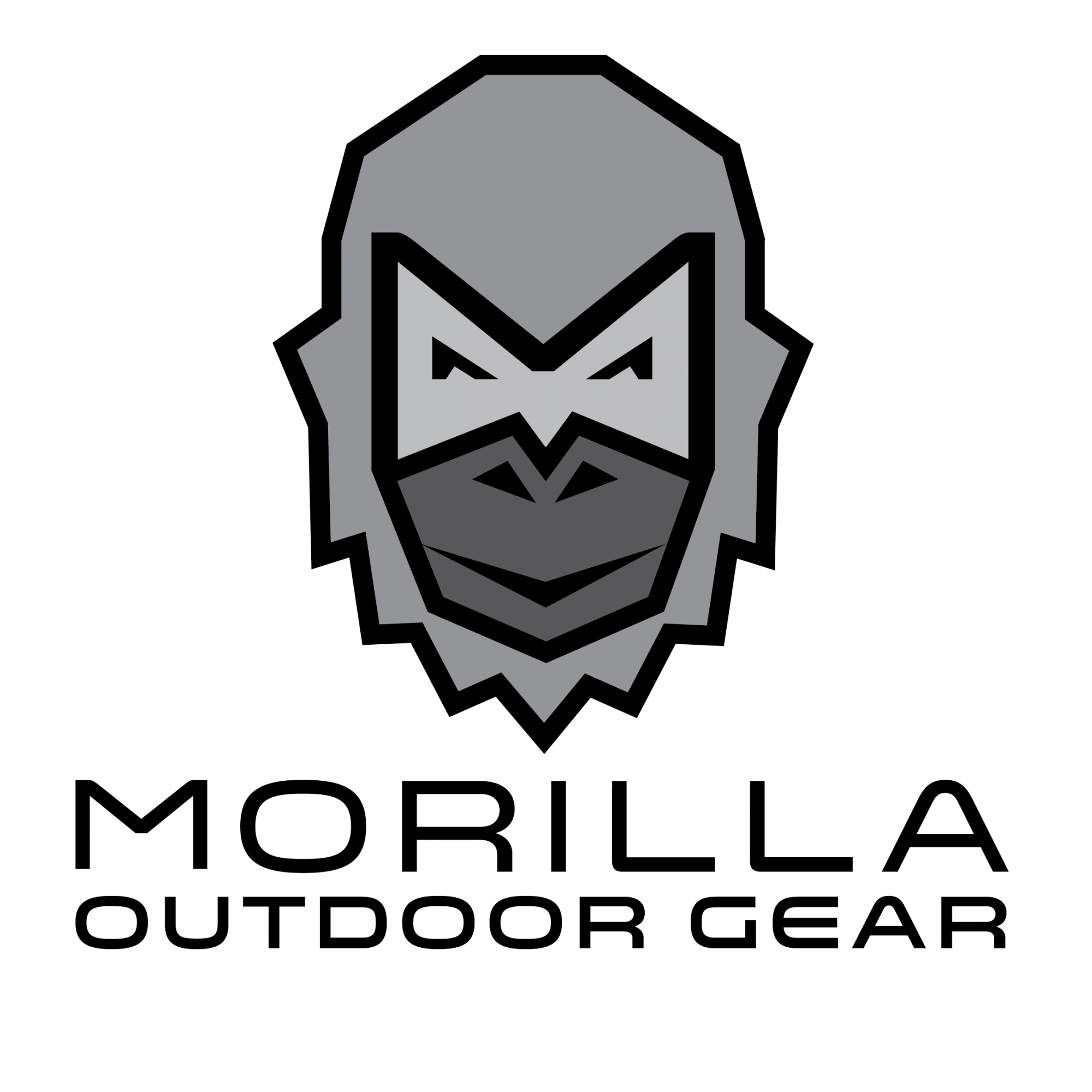
Former logo was a fat cartoon gorilla. Tried to make a stronger, simpler gorilla image using the letter "M" in the design. As well as a masculine-ish typeface that I slightly altered. ** I am certainly not married to the colors- shown here in all black/grayscale.
4 Comments
I'm not sure why, but I'm getting a yeti from this. I can tell what you're going for here, but it could stand to use some refinement. I would also disagree with giving him a happy-go-lucky expression, but that's just me.
I would also experiment with a different font weight for "Morilla" to make the text more interesting. And of course, I'd like to see some nice color options, like maybe a subtle teal/brown/gray?
Overall, this is pretty good. Just some nitpicks :)
His first gorilla was handrawn cartoon with a goofy face, giving a thumbs up- so I was afraid to make him to "mean" looking. I tried to toughen him up with a generic mouth and pointy eyes.
As for type- do you mean change the typeface, or just bolden it?
Bolden it. Just to diversify the two lines of text.
I have no problem with the font. I think the word mark and subtext work pretty as it is. That being said, I always advise to make your basic version without subtext.
I really don't like the symbol though. I also see a Sasquatch rather than a gorilla. It feels rushed and poorly though through. As if you did it directly on the computer with your mouse, from the top of your head. You should definitely spend a few hours drawing a few dozen (and by dozen I mean hundreds) ideas and see what comes up. As you sketch, with the right amount of inspiration, cool stuffs should pop up.
Keep it up!