mothersockers
Aneticekrakatice | Fri, 09/15/2017 - 18:04
Brief from client
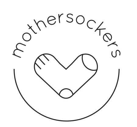
Logo for a hipster brand of socks. To be used also on the package (the thing that clips the socks together).
Client wants the brand name written together with small m.

Thank you all so much! This is my first logo so I might be a bit slow and clumsy about finding the best solutions...
I tried to match the stroke of everything and I think it actually did help the overal balance. For the typography, is this better? I thought maybe the rounder shape would match better with the circles inside the sock.


5 Comments
Damn, I didn't have to comment on your first post, you fixed everything that needs to be improved.
The kerning probably needs a bit of fine tuning and the symbol too (the connection between the straight and curved lines), but other than that, this is a keeper.
Good job!
Thank you! I will fix that.
How. Freaking. Adorable.
Yes! Great improvements! Now for a few nitpicky things =)
Check the kerning (especially in the MOTH area)
Consider rounding the ends of the strokes on the half circle and the 3 lines in the sock (now that you have a rounded font, it will unify it even further)
Good job!
Thanks! Good point about rounding the ends that will for sure help. :)