Museum Resilience Logo
Brief from client
Client helps museum professionals (heritage expertise) develop new skills in order to help them boost their career, and to help their museum build an audience, improve their marketing, and generate income. They do this through online courses and one-to-one coaching.
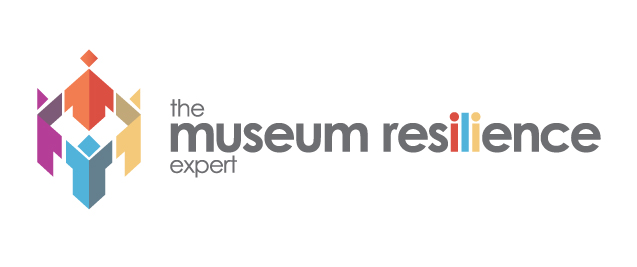
Icon is both a castle and people joining hands, representing consultancy and heritage, reflecting clients business.
Several concepts shown to client, this is chosen one.
However I don't think it's quite right, it needs to be friendlier (client 'approachable' personality and wants logo to reflect that.) Also I'm not sure of the relation to icon and type. The title is quite long and I've struggled to get it to sit nicely! Despite a lot of playing around with typography.
Any thoughts would be welcome.
Nina
5 Comments
I like it a lot. Maybe the only thing it needs is better color placement in the type. Perhaps change "the" and "expert" to red and blue, accordingly?
Otherwise it's very well done. Great job on this.
I like this a lot too but i think there a couple of things you could do.. I dont get the colours in the "ili" part, they kind of dont make sense to me and make the word resilience harder to read. i would make them the same colour as the rest of the text.
you say that the title is quite long which it is! have you tried putting museum resilience on tow lines? i think it would look better as it means you can get the text to match the height of the symbol then.
About the personality.... i think it looks quite friendly and approachable as it is and i dont really no what to suggest to make it look more approachable - perhaps try using a different colour for the text other than greys.
Good job anyhow! :)
Thanks to you both!
I will settle on this design then for sure... I have been over thinking it I think! Just a bit of finessing with type and colour.
With the coloured 'ili' I was looking to add a bit of interest, but to be honest it doesn't really mean anything so I'll omit it.
Thanks for your comments.
I think the icon is great!
Muy bueno.! Me gusta, la realización del isotipo y la conjugación de los colores.