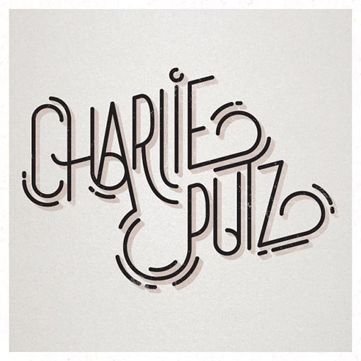
New personal logo
Shawali | Wed, 01/28/2015 - 19:59
Brief from client
Hi guys.
I haven't worked on a personal logo for a while, and since it seems to be all the rage on BotW, here's the 2015 iteration.
My recent new year card was the main motivator behind this logo, obviously =)


7 Comments
And the signature.
Awesome, this one is way easier to read. The spacing in Putz makes a world of difference. I also like the shadow you put on it, which I'm normally against. Good job man.
definitely more readable!
This looks mega mega cool! The changes have really improved it! awesome job man!
Although Putz is an unfortunate surname to have, I'm really liking the logo, although the sign kinda looks like "chop".
Cheers
Tell me about it... They even made a movie about it in the 90's =)
But I learned to be proud of it over the year. And it isn't as unfortunate in France as it can be in the US =)
The signature does look it spells "chop". I'll have to see about that.
Thanks for the feedback.
I love your style. Only thing I'd say is that it's a bit too much empty space inside P's tail. Also A seems kinda too tight.