Newest project
darkreixor | Tue, 07/28/2015 - 16:08
Brief from client
vineyard logo :)
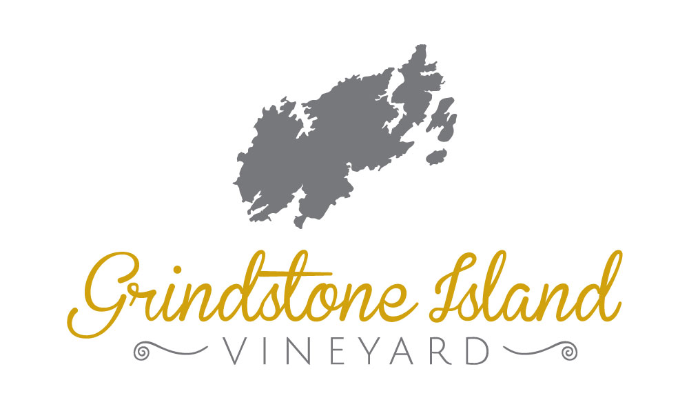
This is a vineyard that on an island... so I've used the actual map of the island and traced it :D
I have tried to match the thickness of the subtext to the "vine lines" i have placed on each side of it.
The main color needed to be gold so that's what i have used on the main text, and I have used gray because...why not? haha and I also like those 2 colors paired together.
Does it makes anyone want to drink wine? if yes then my job is done, if not i've got some work to do hahaha :D
5 Comments
It seems you've sensibly taken design cues from other labels, but misapplied them stylistically. Using a gold script font in the main ID with fine stroke, widely spaced subcopy with accent line flourishes to frame it is definitely a traditional contemporary wine label design. That sort of motif is formal, dignified, and elegant. However, this particular script font is more on the casual, playful side of things. I think the font for "VINEYARD" is good, though I would widen the letter spacing and make the letters about 75% their current height. The accent flourishes you've selected are much too playful, almost childish.
I like the idea of using the island map in the design, but I think if you approached it differently it might work better. That region has a rich maritime history, and a long running tradition of winemaking. Perhaps you can tap into that theme? I've found some older historical maps of the St. Lawrence and Lake Ontario, something like this would make for an interesting background, if faded like a watermark so it's not too obtrusive.
All in all, the work you've done isn't bad, but I think it needs refinement. People often select wines based on the label, so if you're going to do a very common style you really have to nail it perfectly or else those bottles will just gather dust.
I will not check Idea, Symbol, Typography or Colors, as of yet... Wonder if you would consider to incorporate your symbol into a grape leaf, if you know what I mean? Does a grape leaf stands enough for a vineyard - I think so. Curious to see end result of that, as I think a silhouette of Grindstone Island would be a wonderful signature running across a grape leaf for a cool and memorable logo.
I'm usually not a fan of incorporating silhouette of a map in a logo, especially if it's immediately recognizable. Which is the case. Of course, if this logo was aimed at people living on this island, it could be argued. But usually, it just looks like some kind if random stain. But you could use that as an idea: wine/stain...
I really like the font work though. This cursive and that non-serif compliment each other pretty well. I particularly like the ornamentation on both sides that have the same thickness as "vineyard".
Globally, I think this is very elegant and fits perfectly that type of business. Minus the stain, obviously =)
Bon boulot!
I absolutely for a vine/stain idea, what a clever way to execute both - a geographical location and element of surprise that most of us forget about it. Way to go, Charlie! If only a designer get that vine stain so realistic... Good luck!
thanks for the comments! i will work on it, and upload a new version very soon :)