nkt3
omidz | Sun, 08/02/2015 - 22:16
Brief from client
First drafts for a newly established 'trade show, exhibition and events organizer company'
nkts3
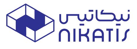
First drafts for a newly established 'trade show, exhibition and events organizer company'
nkts3
13 Comments
For a symbol sake only - I like this one the best, it has a charm and a clever solution how " N " being incorporated into a box shape. Would be interesting to know about an upper font origin.
thanks for your input. do you think i can eliminate the unbalance sort of feel of the design by choosing a more consistent typography or should the element be tweaked as well?
I wouldn't bother a symbol at all, but put an effort on a typography and a placement, as well.
I prefer this option among the others. But Am not sure about the Arabic, the (س) does not work for me.
Can you make match the thicker of Arabic and English?
Thanks, im currently working on the Typography, i changed the thickness of the Persian font and some kerning adjustment, i think it already became more pleasant to the eye.
You know what? Maybe this works pretty well on its own. No need of a symbol. There might some tweaking to do but I think it can work.
I agree, the standalone version works nice. I would either make the type above thinner or another color to create a bit of separation, however.
The best thing this has got going for it is its clever "N" placement. The font is nice too, but the two don't relate. One is beautifully rounded, the other is more straightened. I would work to unite the two ideas.
Thank you, i`m working on it a new Typography and it'll soon be uploaded.
as for the sign, do you think i should keep it untouched or continue working on it?
I really like the choice of typeface and how the Arabic and the latin one interact really well together.
I'm really not a fan of the symbol. Though the placement is clever, the whole symbol feels very dated and it only relates to the latin version of the brand name. The all blue color scheme is also very dull, I find.
I'd suggest to work arround the arch which you can find in both the alphabetical form of the word mark (the n) and in the arabic text.
Good luck!
thanks for the input, what do you think if i make use of the 'n' shape you mentioned to make some element like the one attached?
the stroke of the font isn't the same on the bottom and top text, i like the idea of your symbol but i have no clue what it's supposed to represent?
Thank you for the input.
The symbol is supposed to represent a 3d perspective view of an exhibition booth with a letter N inside it.
Ive changed the stroke and adjusted the kerning.