Ovinea
Oxyd | Fri, 02/12/2016 - 12:07
Brief from client
Little website that sells wine bottles
Hello, it's been a while since i left this community. (even it seems i lost my account? weird)
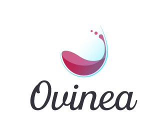
Well, this is it, i'm working on this tiny logo. I feel kind of rusty in logo creation soy i ask for your advice. what do you think? does it work?
3 Comments
This is looking pretty good!
But I'll tell you what: the first thing I thought was that you could get rid of the blue stroke and gradient in the symbol. It would simplify things and make the whole logo even more impactful. I certainly don't really like the fact that the blue gradient goes over the wine and screws with the burgundy tint.
Nice choice of font.
Good work overall!
Yeah, I'd definitely like to see this without the glass. It distracts from the overall design, and simplicity is key.
When I open the website page and saw your three logos,
I was sure it was for panty liner.
Than the blue in this logo made me see it that I was wrong.
As a wine drinker, this logo appeal to me.
Taste are in the nature, I like this one better.
=O)