Pathway DTP
jarrad113@gmail.com | Sat, 12/06/2014 - 21:16
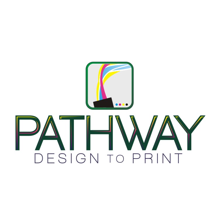
Brief from client
Starting a design/printing company. I will subcontract some printing and offer dtg on site. I put this together so I can start a FB page and web site as I need to start doing business.
I value this community and the insight offered so please let me know what you think. ..
6 Comments
I think it is important to note I am starting a DTG printing service. This will be the anchor of the business and I think the cmyk was important as you can see it in a lot of print logos.
Thanks BOTW peeps
I kinda like it. Barely. What you should drop is the colors in the font. Not a big fan of those. The colors represent the company, but are highly overused (HIGHLY). And I think that the circles with the CMYK colors can also be removed, as I think they are a little too much.
On the other hand, if I were you, I'd focus on the name of the company: PATHWAY. You have a great opportunity with that name, and therefore I'd suggest you continue on version 2. Just with even more focus on the pathway itself, instead of the sky. Good luck!
I agree with the above comment: the treatment of the font, which is good in and out of itself, is superfluous and doesn't bring anything beside complications.
Also, one of the golden rule of any form of creativity is to avoid going for an idea that has been done to death. In your case, the CMYK think is something you can forget right away. We get this stuff at least once a week here. This is ground zero of creativity.
Keep working on it, you have the font work and the composition almost done pat, but you need a good concept. I tend to think it generally resides at the tip of a pen =)
Good luck.
I completely agree with everything thats been said. I think the main problem here is that you do not have a solid idea. Your subtext says from design to print. So why not try to show this in some sort of symbol. Ive attached something i did a few years ago for a poster only to show you an idea to try to get your thought process going. Go on pinterest, google etc and look at other print company logos that arent the usual CMYK thing
CMYK is so overused that I think that the only companies that can actually use a CMYK logo at this point are companies that specifically do nothing but manufacture CMYK inks.
For example, this company I would let use CMYK.
If I saw a design company or print company using a CMYK logo, I personally would avoid them as much as I do with ones that use Papyrus font.
Symbol: Not to be mean or rude. But what is that about 'PATHWAY'? Unless you are going to play with "Registration marks" as part of your symbol I would remove the dots. It looks like something off a box of toner.
Colors: Yes I agree CMYK is used a lot. It looks like you are doing CMYK & RGB? Keep it simple you have a lot going on. Less is sometimes more.
Type: I like the 'W' Not a fan of thin fonts - just because printing them can be a problem.
Question: Are you doing digital print or press print?