Personal Brand Mark
VossBoss | Thu, 03/01/2018 - 21:12
Brief from client
My initials are NJP and I've been using a handwritten version of this mark since middleschool.
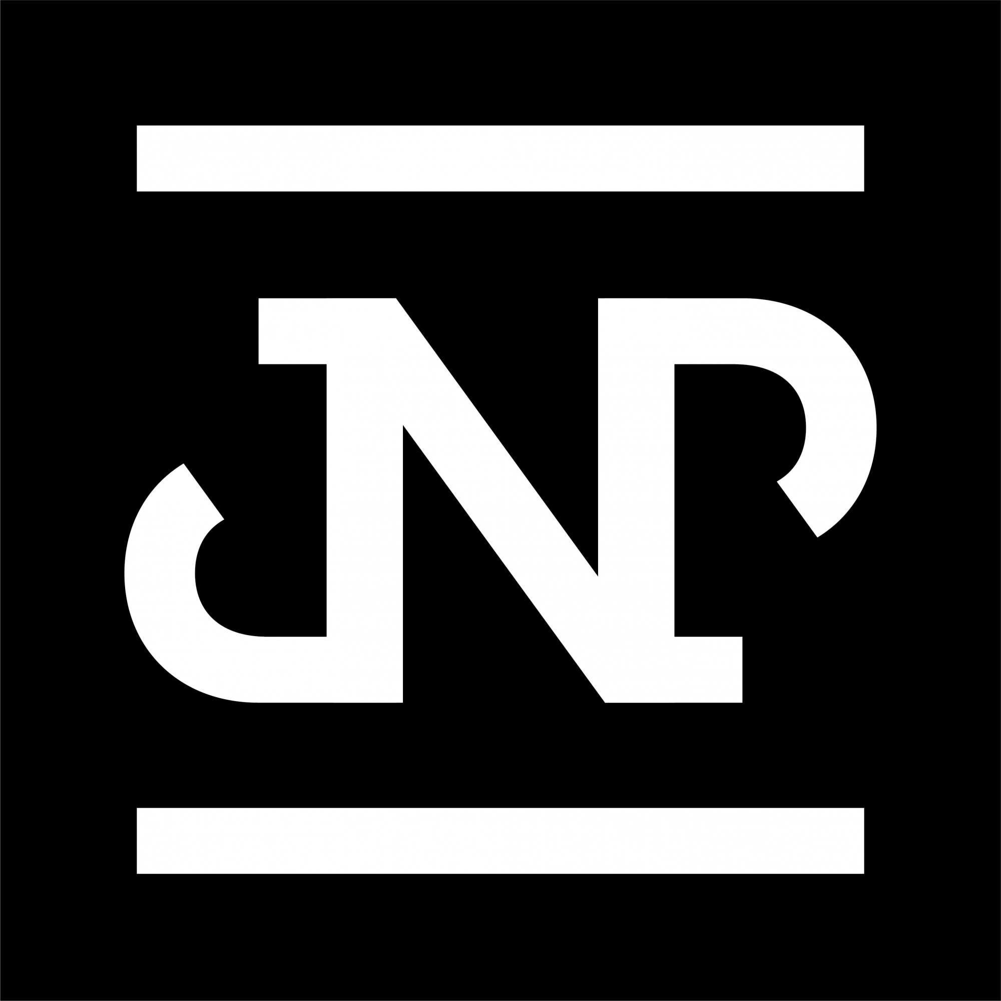
I've updated the J and the P in order to allow the caps to function as a serif for the P or a cap for the J. I also updated the curve of the J and P strokes as they felt too sharp in the previous version.
I think additionally, shortening the caps makes the N stand out more as a previous commentor mentioned having the J first when my initials are NJP was a little strange.
6 Comments
To me it still says J N P.
Have you tried switching it up as NJP? get creative with that instead of this logo. I mean it is a good idea when your initials are JNP.
I'm reading J N P as well any way I try and view it.
We read left to right. It is going to read JNP unless you move the N to the left of the J. The only way you could get away with having the N in the middle, and this is a longshot, is to make a drastic design change to push it into the foreground and the other letters into the bg. Still, I struggle to see how that would work.
You are revising and revising trying to get this idea to work. I think you need to start fresh with a new concept
I just think there is no way it can work with the letters in this order. You are wasting a lot of time by revising the logo over and over. Shuffle the letters and start over. It can be frustrating at first but once you got it right it will be even more satisfying. Looking forward to something refreshing!
Ok- I've been holding my thoughts to see how others perceive this logo- but my honest opinion is that it doesn't work at all. I read JNP as well, and even that isn't so clear. One could argue they see a lower case d, or even just an elaborate N alone. I agree with a comment above regarding reworking a logo over and over trying to make it work is generally a sign that it may need a total rethink. Try to step away from this logo, at least for a bit, to get some fresh perspective.
In my opinion the J and P should be slightly different. Really like the bars top and bottom.