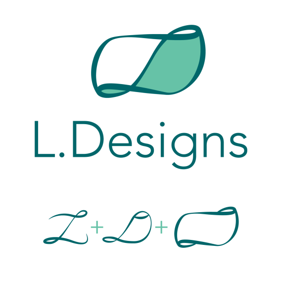
Personal Logo
Mystilik | Fri, 10/17/2014 - 23:26
Brief from client
This is a personal logo for myself.

This logo is made from the elements shown below the logo itself, basically the L comes from my first name, the D stands for Designs, and the ribbon shape was made using the L in mine at first.
But I then took notice of the D shape and chose to tie it into the final piece, in which I am quite happy on how it turned out.


5 Comments
Good idea. And i like the end result. But the first thing that came to mind was chips (image for reference) The L & D is not noticeable at all though unless you explain it. Just looks like a nice ribbon.
Also watch your kerning.
Ah I do see the reasoning there, anything you would recommend to aid in the symbol itself.
Darn kerning, always sneaks up on you.
Well at this point your best bet is to make the L and D more visible/noticeable Maybe simplify it a bit so the letters stand out more?
This logo seems nice, if you will always keep the footer notes to explain what it means, and how it's made, otherwise, it looks like something a 2-yo child did with crayons. :)
Sorry, I'm not feeling this logo. For some reason, the symbol makes me think of a sanitary pad. The colors don't real either.