Personal Logo
Brief from client
So I'm updating my portfolio and feel like I have some nice work to show, but what kind of designer doesn't have their own brand, right?

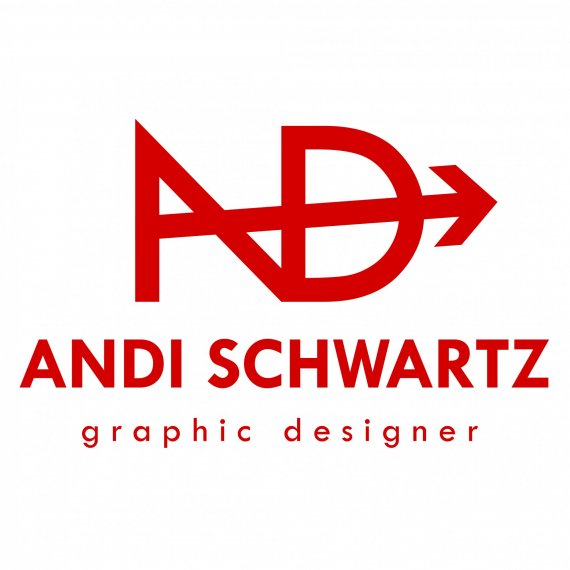
So I'm updating my portfolio and feel like I have some nice work to show, but what kind of designer doesn't have their own brand, right? I sat down with pen and paper, drew some sketches. Then replicated on the computer. My thoughts... my name is Andi... I also hunt and compete in archery and I wanted to reflect that somehow without being too literal (the "D" makes a bow)... the arrow also shows forward direction, movement. I tried making a two color logo, but wasn't liking it. I love deep red, but could really adopt any color palette with this mark. I like it also white in a reverse. My concerns... does the point of the arrow look like I used clip art? I created it with the same degree angles as the "N" as well as thickness. Is it okay that the arrow makes it feel a little unbalanced? Maybe the angle and point of the "A/N" help that? I tried making the arrow come out the left side, but I felt it took away from the arrow and the "N" making the "A".
I did put a lot of thought into this and am really attached to it. I slept on it, and got up this morning and saw it and I'm still loving it. But I need other's perspectives as I worry it looks like I just slapped some letters together with a clip-art arrow.
My portfolio: www.andischwartz.me


8 Comments
Clever idea and color - everything else must be thought over... I immediately see " ND " with and arrow across and it took me a while to see " ANDI ". Also, " D " doesn't really look as a bow, because a string that holds an arrow not stretched and an arrow usually placed centered , never on an angle. Again, I'm a fan of your initial idea - now work on a clever execution to make your first name to be instantly read at a first glance.
Thank you for your response!
Hello Andi, I have some clever ideas on your logo... I'll start working on my own and will be glad to show them after they're done. Here is my email addres : hacobcem@gmail.com Feel free to share your thoughts and ideas with me. Your initial attempt on your logo inspired me.
This does nothing for me. I, too, see only ND. I have no earthly clue as to why you are shooting an arrow through the abbreviation for North Dakota...unless you intend to publish your explanation on the back of every piece you use this logo on. I realize you are a hunter and you love this design, but hunting really doesn't have anything to do with logo/graphic design. I would love to see what other thoughts/ideas you came up with.
If I agree with previous comments.
I visited his briefcase and found a good content and many creative ideas, I see you have a great ability to create a good brand.
I would like to see other options :)
This is not bad, but that angle applied to the arrow looks random and makes the whole thing uneasy to watch. Maybe let it horizontal and also remove the left vertical bar on the D.
It doesn't really matter if it perfectly AD or not. A logo shouldn't be as informative as much as it should leave an impression.
Keep it up!
I made this for Andi, hope it will inspire her to go ahead and get it done right.
Thank you all for your responses! BOPOTA, I got your email and it has given me some ideas.