Brands of the World is the largest free library of downloadable vector logos, and a logo critique community. Search and download vector logos in AI, EPS, PDF, SVG, and CDR formats. If you have a logo that is not yet present in the library, we urge you to upload it. Thank you for your participation.
Version history
Version 1

- I
- S
- T
- C


3 Comments
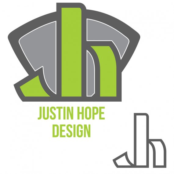
Am I the only one to feel like this logo is flipping me the bird? =)
I've said this before already, but when it comes to your personal logo, avoid the ubiquitous symbol + word + subtext formula. It's fine for corporate entities, but not for a human being like you, made of flesh, feelings and skills.
Check out what the pros do for their own personal logos. You'll see that more often than not, it's simple and tends to be more a graphic signature than a full on logo. Monograms are often met too.
I saw it also
I actually LIKE that you're flipping me off. It's how we say hello or goodbye back home. It's our version of 'aloha',.
It's an interesting way to slice the letters up, perhaps with some tweaking you can make it less apparently obscene.
However, it gets your attention because initially (no pun intended, sadly that was a good one) the middle finger offends or amuses and it holds your attention long enough to process the reality of the letters. One of the most important factors of any kind of graphic design is to get and hold someone's attention, and if you can get them to think, that's a bonus. If you can get an emotional reaction out of them that's even better. Some may be offended --but who wants them as clients?-- but many may smile at the trick, and think you're a clever designer.
I'm pretty sure it wasn't intentional, but so what? Maybe you can make it work for you. There are plenty of clever marketers who have sold brands based on the joke that their customers should go fuck themselves.
Okay, all that aside... your colors are great. I like the bold deliberate strokes of the logo, the way the verticals turn in toward each other to define the letter fragments. It's well done, really.
The subtext is somewhat bland by comparison, but I like minimalism. You could do a little more with it, it seems an afterthought especially given the size difference. I'd say the text should be 150% larger, perhaps, and maybe pulling a color in from somewhere in the icon for the word 'design'. Your name is in a very neat, direct font and I like that but it needs to stand out from the subtext somehow.
Overall though It's good work, regardless of the suggested imagery everyone is seeing. Man, Felix would lose his sh!t over this.