PET Adminsitração
Brief from client
This is my purpose for a new logo to "Programa de Educação Tutorial em Administração" (PET ADM or PET Administração)
The principles of this Program that I tried to catch are Research, Education and Extension, that's why the format is basically a piramid, then I tried to create a mosaic which the word "PET" can be part of it.
Please DO NOT copy the ideas and purposes of this work, any doubts, please contact or comment.
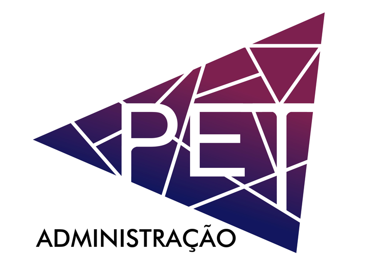
This work is based on a triangle, the differents forms are the members, whose are connected to each other and forming the word "PET".
The colors are based in two graduation courses which students of them both are part of the program, Administration and Accounting Sciences taking a modern perspective with a gradient.
The ideia is to match the three guidelines and activities of the program, associtating it in an concept of network (white lines) and different forms (plurality of the members). There's only one "perfect" triangle, that represents the frontline, the tutor of this program, who can direct the members, and also, is a part of the big triangle.
Thanks and sorry for my English
2 Comments
The idea of plurality of members in lines and forms is great. I like that sharp edge font you used for Administration. But all other things need multiple revision. 1) Have you tried how your gradient will look if printed BW? 2) Do you think that the proportion between the width of the lines and the PET letters is all right? Maybe you should make them to be in a more contrast (ex. bolder PET, or thinner lines) 3) Do you think that the kerning (the spacing between letters) is fine in this work? If you give answers to those questions and make the amendments you will go to a whole new level of your sketch. Wish you success!
I don't mind the colors but the symbol and typography doesn't work for me. It just doesn't look professional. If you want to stick with the idea, I would spearate the words from the symbol and have the triangle separate from the "PET" and "Administraco" and use a different typeface for that.