RG
rgondeck | Tue, 11/22/2011 - 05:08
Brief from client
A personal logo
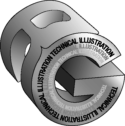
My 'Escher' style technical illustration of a three dimensional logo. I have also hand made a solid copy of it from soft wood.
A personal logo
My 'Escher' style technical illustration of a three dimensional logo. I have also hand made a solid copy of it from soft wood.
9 Comments
this seems a simple design, improve the art, do something with 3d effects of light and shadow ... the idea okay. allow more readable.
BUENOOOO
Wow, settle down. There is way too much going on here. It is unreadable as a logo. The execution needs work to clean it up. Probably looks good in wood.
It needs to be able to work in 2 colors at the most. SOLID colors. The type should be separate and readable.
I think it's a great idea, but currently it looks horrible. Simplify and clean it up.
I'm sorry but this hasn't worked at all. Typography is illegible and the outline of the logo is so rough and for someone that claims to be a technical illustrator...
I suggest starting again with clean, crisp typography perhaps with a simple line detail.
Hope this is of some help
It's an illustration. Not a very good one and certainly not technical enough.
The idea is good but out of context.
If it were a school of mechanics, would be perfect.
I can't read the inscriptions. The "R" and the "G" were put together with excessive force.
I like the colors but other than that not a fan.