Sept Terres
fredrg | Tue, 06/28/2016 - 21:17
Brief from client
Interesting challenges on this one. All the signage in the historic building where the restaurant is located must use Futura and here is the interesting part, half of the client partnership did not like Terres spelled with two R's (no explanation other than "it doesn't look right") the other half had emotional attachment to the name.
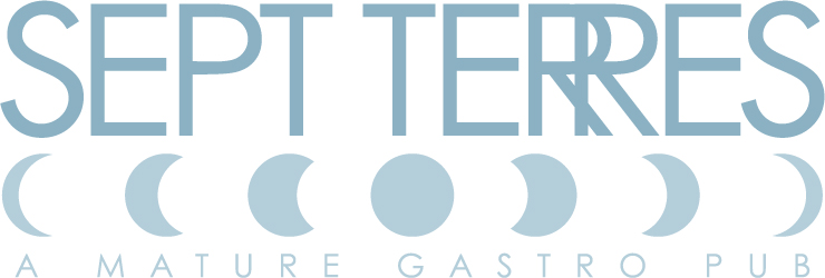
So there you go: have to use Futura, double R's look funny and "Mature Gastro Pub" is a silly name. They love the final at least.
12 Comments
I actually didn't even notice the "A Mature Gastro Pub" part until I read that bit in the brief.
I've gotta say, you've been put in a very specfic, unfortunate position with their silly client-imposed restrictions, but I don't have to tell you that ;)
There really isn't even anything left for the designer to do except possibly a logomark. With that said, I do like the moon phases, although I can't really explain how I think it fits the theme.
Here's what I would do: present this idea, and one of your own. These guys seem very narrow-minded, but I believe the key is how you approach the matter. Try and coerce them to think outside the box, and offer a vision of your own. Remember, they hired you because they aren't the designers. But be nice about it :)
Good luck.
Sept Terres = Seven Earths, hence the phases. I have been hit with architectural constraints for signage many times, but this is the first time I've had it imposed on the logo font. It's an interesting gig, In my contract all the tenants (only 7 or less at a time, the rest of the building is condos) have to use me to design or approve their logo. Same with interior design, all through the same small firm. I have bar and a burger place going into the same building to work on next. Just have to have the restoration board approve and they are strict about the Futura, even turned away a Starbucks franchise to preserve their esthetics. Actually surprised I got away with the overlapping R's.
Hello Fred and how are you!? My apology ahead of time, of course. Would you ever consider this option?
No. Too Texas steak house/branding iron, plus messing with the font is against the rules.
They did not like "terres" spelt with two R?!! Are they fucking stupid? "It doesn't look right" my ass! This is just how it's spelt, Claytus =)
I think in this context, "terres" might be better translated to "lands" rather than "earths".
Hence I'm not a fan of the 7 phases. Moreover, it looks more like the lunar cycle.
The overlapping R are really distracting and screws with centered justification.
Globally, it's just too complicated.
Man I feel for you, this client seems to be a major pain in the ass =)
Sorry Fred if this sounds a little harsh but I'm not liking this one much.. Un-like the other comments though i dont think its such a bad thing that the client has restricted you to use futura.. At least then you dont have to spend hours finding a font or trying to make your own. I like the idea of the 7 phases as it goes with the name but im not a fan of how you have portrayed it / laid it out. I would try placing them above the text, smaller and on an arc. The double R thing is soooo distracting, i know thats not too much to do with it being your fault but you should really get some clear brief stating whether they want 2 R's or 1.
Ive seen you do much better so i feel a bit disappointed :(
Symbol is meant to be a red thumb not green, i cant change it though
Whoo! You and Charlie are hard asses :)... This has been a challenge, yeah they are nut jobs, but it was clear from them they wanted terre spelled correctly, they just thought it looked funny that way. As explained to me the menu has middle eastern flair to western dishes with a french twist (think hummus-foie gras burger) so thats why I was ambiguous with the moon/earth. You can interpret it as crescent moon for the eastern influence or earth for seven earths. Color wise 90% of the final usage will be brushed metal finish, either actual metal or foil stamp. Happy clients and a decent check, lets see if I can do it with the same constraints for the next few tenants or if I lose my mind trying.
Oh i didn't realise that this was a done deal! Good luck with the next ones!
Your clients seem to have some issues to work out on their own before that hire you to start. The overlapping R's look like a mistake...and you never want that. The tagline 'A MATURE GASTRO PUB' is the worst description for a restaurant ever. I'd never eat there because it sounds kind of gross. And when you read it quickly, it looks like AMATEUR GASTRO PUB which is even worse. I'm really sorry you have to deal with this...
I like a challenge I guess. To me sometimes it's not about getting a portfolio piece, but meeting a ridiculous request or deadline with a solution that satisfies the client and doesn't totally suck.
Poor you... that's what I saw.
Seven Earth
seven moon images
gastroenteritis
Because in French having a «Gastro» is that
and not having a «gastronomic» diner