Brands of the World is the largest free library of downloadable vector logos, and a logo critique community. Search and download vector logos in AI, EPS, PDF, SVG, and CDR formats. If you have a logo that is not yet present in the library, we urge you to upload it. Thank you for your participation.


7 Comments
I got an idea for you. Get a 7 and rotate it and place it in the v position.
This way you will literally have a seven in your logo, and it kind of looks like checkmark too.
Like this:
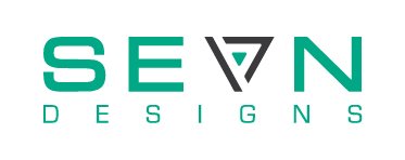
the reason its shaped like that because its a play on my name Sean
Ok, but you did said it is pronounced 7, and I think people would think you want they to read it as sevn, with the meaning of seven, not Sean.
He does want people to read it as seven, see it spelled as sevn, and get the idea that it is referring to a number 7. Which is done successfully. The play off of his name sean is just an added bonus layer that you won't get until you contact him and realize his name and that's fine. The example you posted with using a 7 looks really imbalanced. There could be an idea there, but this design that he has originally posted is stronger.
OK, now I understand why he chose to do this way.
I like this, it totally works. The only thing I would change is the subcopy, I think the font should be wide as above, instead of compressed.
I dont like the fact that the triangle is a different width than the letters. I makes in imbalanced. The color is way to saturated for me but other than that I love the idea of the play on words