Speedle Mood
Brief from client
Hi guys and girls.
I'm playing in this band called Speedle Mood, and I get to create our logo.
Those who know me know that of course I'll go full hand -lettering =)
To give you a bit of context, we play covers going from Guns 'n Roses to Portishead, via Johnny Cash and Mumford & Sons.
Tell me what you guys think!
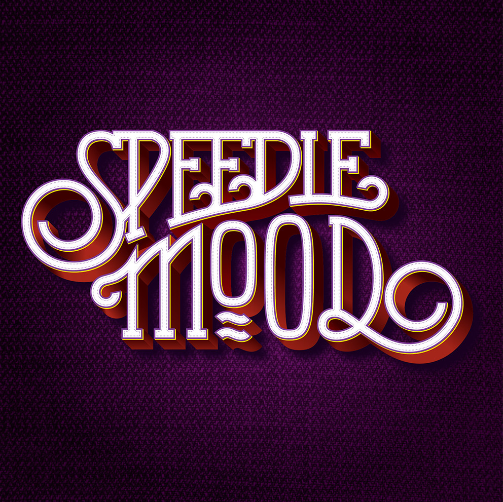
Following Shaun's feedback on version 1, I reworked on the "mood" part, unsquizzing the O's and giving them more space to breath.
I also got rid of all the pointy ends on the swirls. I thought they look a tad bit aggressive and where a major ass pain to handle. I also discover the swirl tool on Illustrator. Even after all these years, you still discover new things =)
It's always when you think you're done that you realize there's still much to do
15 Comments
Two alternative treatments.
Love it! Very cool.
The only thing i like less is the tip of the "D" between D and O.
WOW! this is awesome Charlie!!
Just seeing it on the thumbnails i knew this was your work.
I love it! i also really like the version you've posted in the comments here, black on white background
I cant think of any amendments to suggest apart from the word mood is easier to read than speedle, i think this is because theres a tad more space between each letter in mood - perhaps you should create bigger spaces between the letters in speedle to match and to make it easier to read.
I like them all is a great job and is seen to have a lot of work on the
Excellent! beautiful job.
that looks sharp!
Thanks guys! After all the time I spent on this, it feels nice to get some positive and constructive feedback!
Do you guys also read "speedie" instead of "speedle"? Since Edstroem's comment, it kinda bugs me =) It's true that compared to version 1, the L and the last E are closer to each other.
You could do a little separation between L and E to avoid that little confusion.
Just get them to change the band name!
I came up with the Speedle part! =)
I would have to fine tune it a bit more than. Which should take about 10 min. Then redo the whole purple treatment. Which should take about forever =)
^-^ Even easier to change the name then! We only need to convince you!
yea i agree that at first glance i read it as Speedie, pehaps a small gap needs to be put in between the i and the e, then you can open up all the other letters a tad more to and the whole thing will be easier to read :)
Keep at it man! it will be worth it in the end! :)
I like this a lot, super super clean lettering. But I also read speedie moods.
Damn Good. Don't change the name either. It's soars above the usual grinding banality, although i hear that the www.onedirection.com domain is coming up for renewal ;)
Are you spamming for the band that should not be named?! =)
Unfortunately, they're just taking a break, apparently. Ho, we'll take what we can.
Don't worry about the name, it won't change =)