SPOOKY
MB82 | Wed, 11/09/2011 - 06:23
Brief from client
Logo for my portfolio.
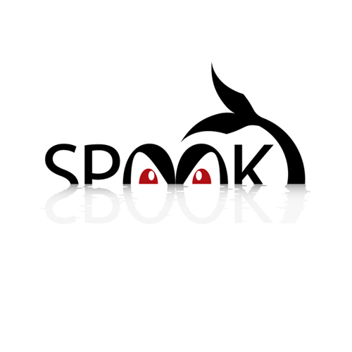
Spooky monster lurks from the water:) Those sharp eyes are looking directly into the eyes of observer so he will feel, consciously or unconsciously, that he has entered into a certain interaction with the logo he facing.
16 Comments
AMAZING WORK
Thanks :)
Depending on what is actually INSIDE YOUR PORTFOLIO this could work.
It's cartoony and catchy and if it corresponds to your work well, you have a winner.
creative idea, great work
This is really great. My only concern (from a personal opinion) is that the negative space created below the midpoint of the K feels odd. Perhaps because if the reflection hit the K at the midpoint it would create a perfect reflection of the letter. Of course that wouldn't work well for the S and P, it would look more like EBOOKY.
Though possibly difficult to translate into a company/product brand, the logo concept itself is great - good use of symbolism and negative space, and a great play on words. Only negative I would say is the 'y' is slightly too exaggerated in my opinion. Great work.
Nice one.. I can't think of anything to add that hasn't been said.
Nice work.
very creative idea, great work !
and it will be more atractive if the color of sea will be in light blue color, just my thought...
This is cool! Nice work :)
Thank you guys for your concern and constructive critique. It is been helpful and sincere and i appreciate it. I think this logo is good to go on my "Stocklogos" profile now ( http://stocklogos.com/user/milos-babic ). Please, feel free to comment on my future designs ( http://www.brandsoftheworld.com/critique/smart ). Looking forward to see you on my (or yours) next project. All the best!
WOW!
Creative and impressive.
Of course, my personal opinion is based solely on your work.
Without knowing your Client briefings.
My only concern about "Y".
The observer need a little time to understand that it's a letter, not a drawing.
In any case: great work!
I think it's really amazing, you put some thought into it...
Not sure about the "Y" seems a little too much. In Afrikaans if someone did not notice the "Y" the word would now mean Ghost...
Really great though..
really good...
Great job, I learned to create impressive, with colors that fit perfect.